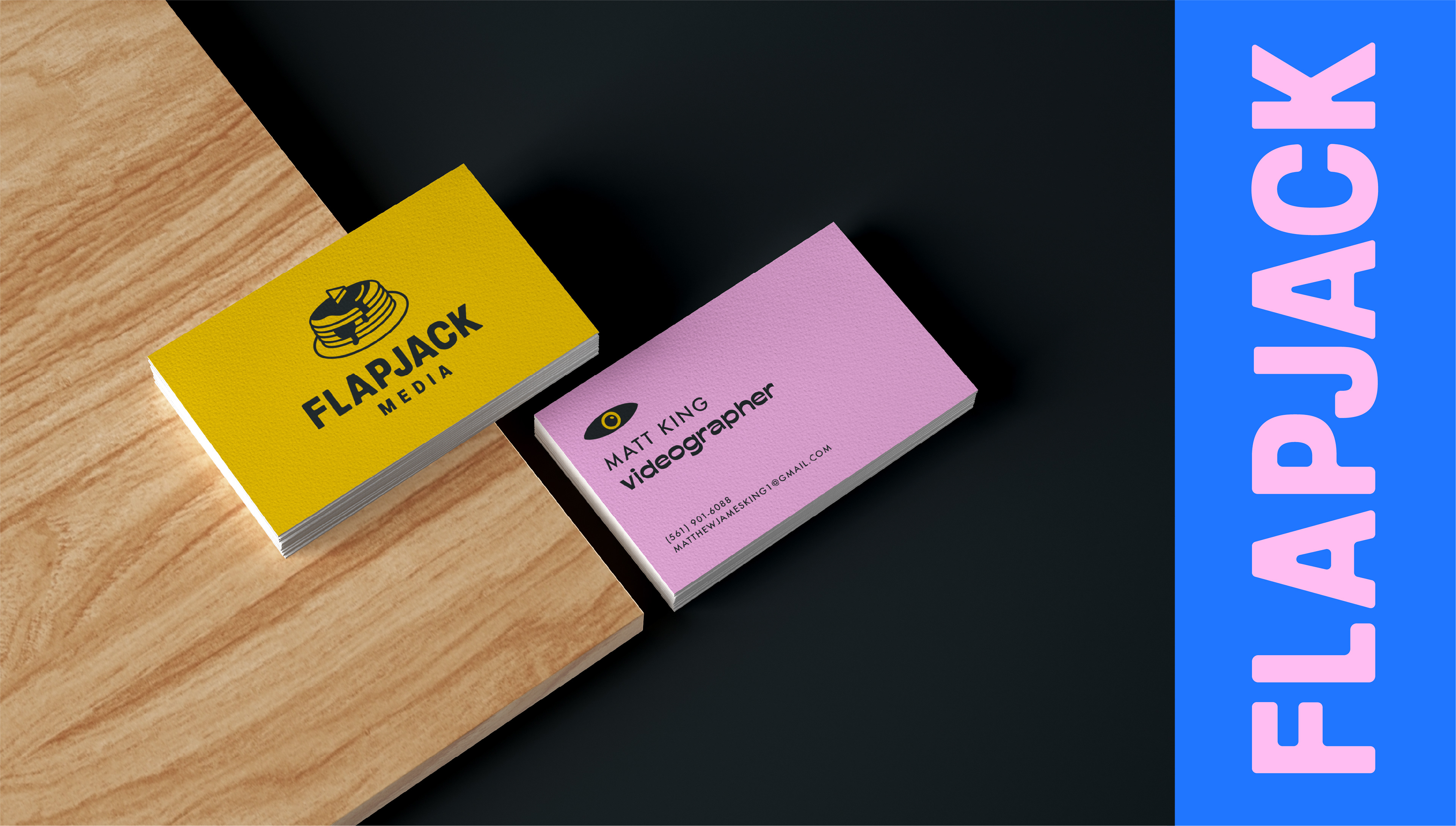

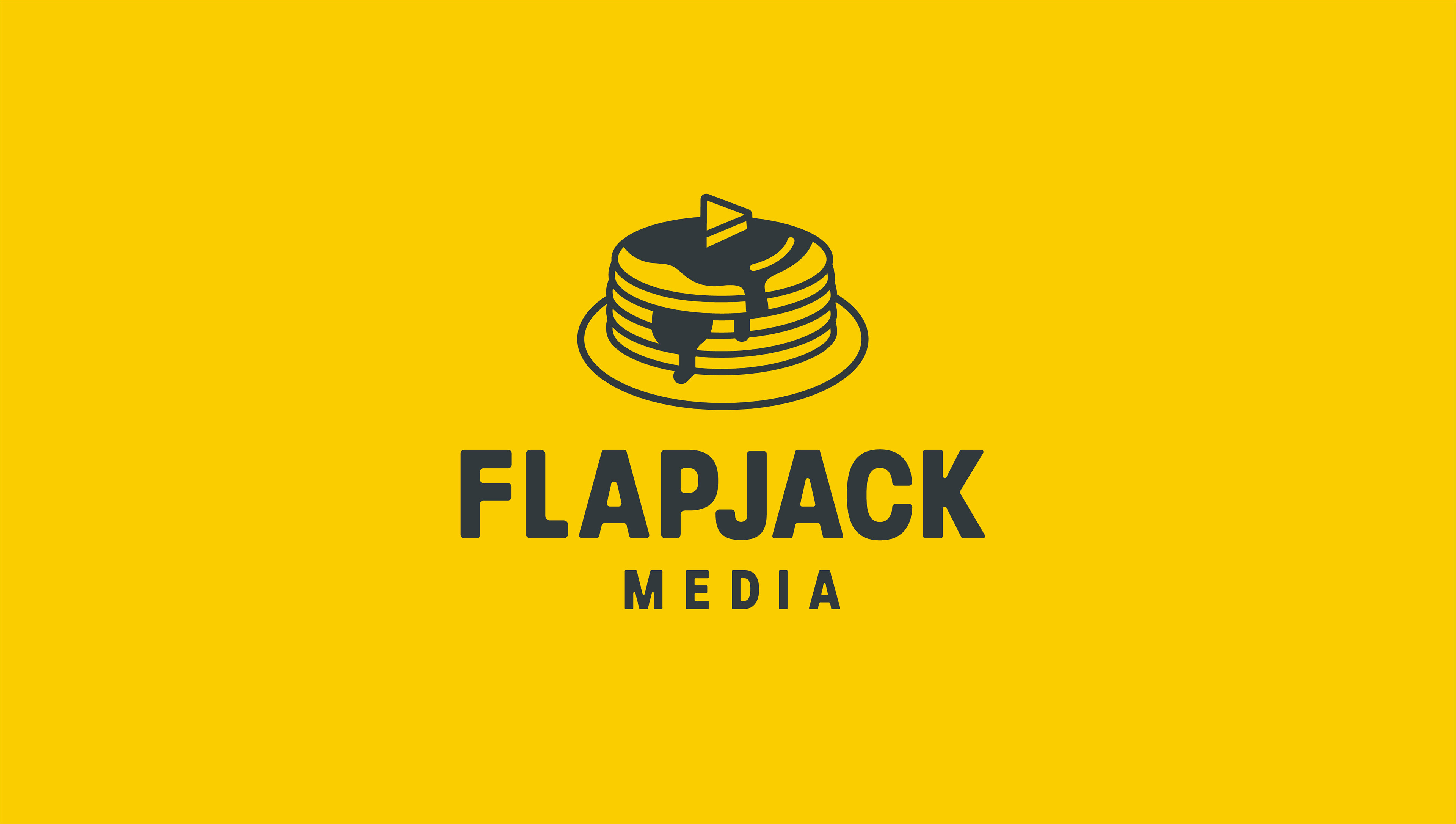
Client: Flapjack Media
Discipline: Brand Identity
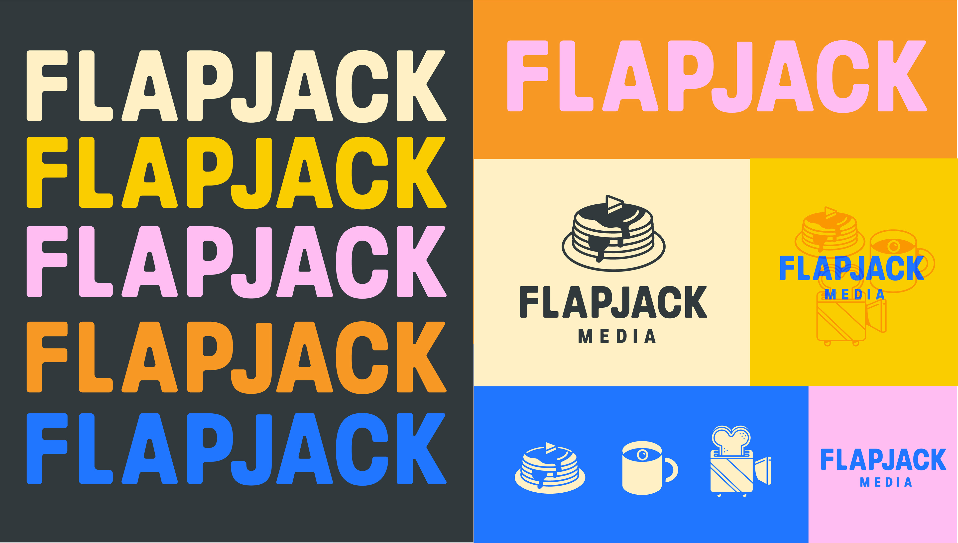
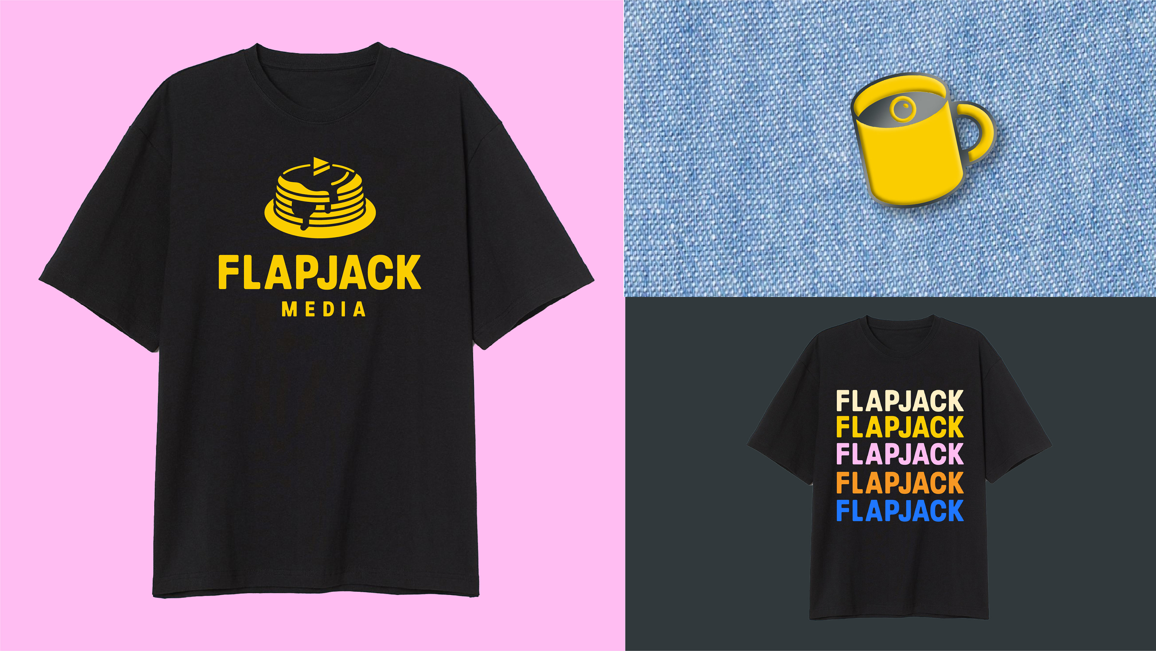
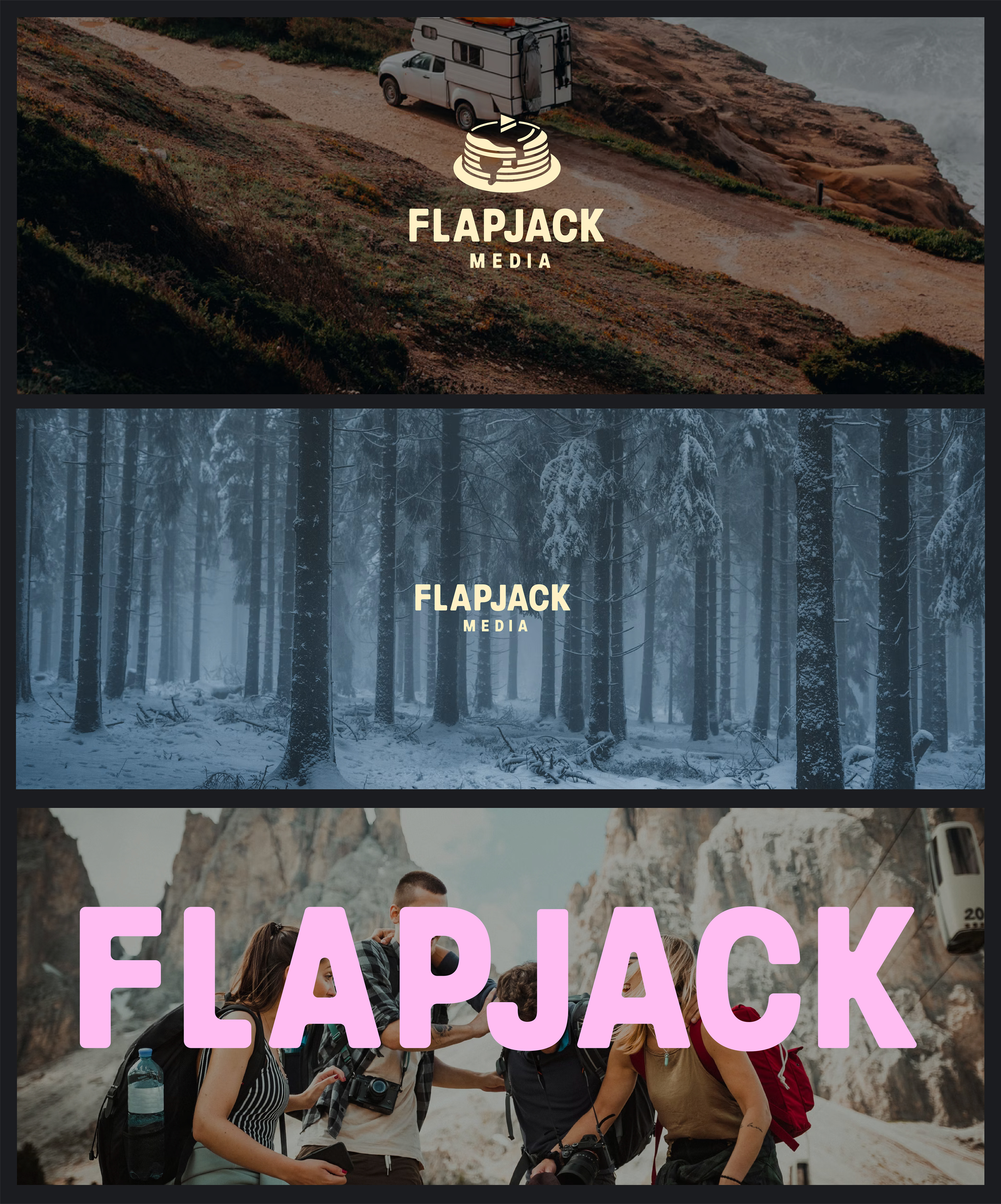
Flapjack Media is a brain child of Matt King, a Florida based videographer specializing in event videos, promo videos, and vlogs. We knew we wanted to honor the name in a pretty straight forward way, so a stack of flapjacks was the perfect move, topped it off with a little play button butter. I love the retro feel of this and was heavily inspired by old diners and vintage food chain branding. It's bold and punchy, a little weird, and playfully edgy.
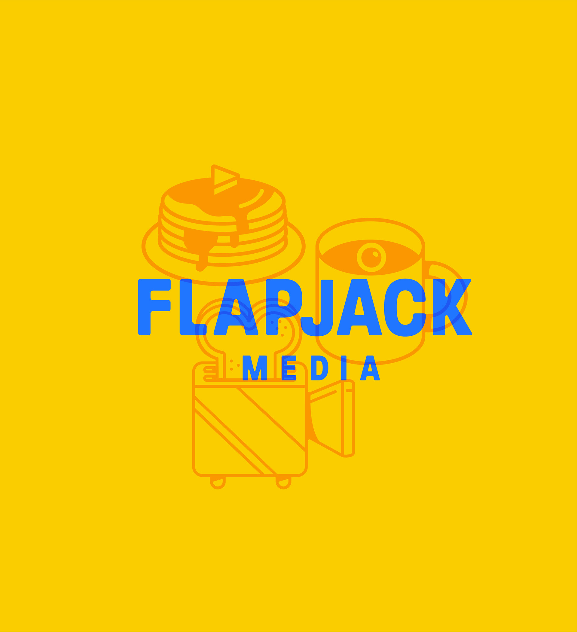
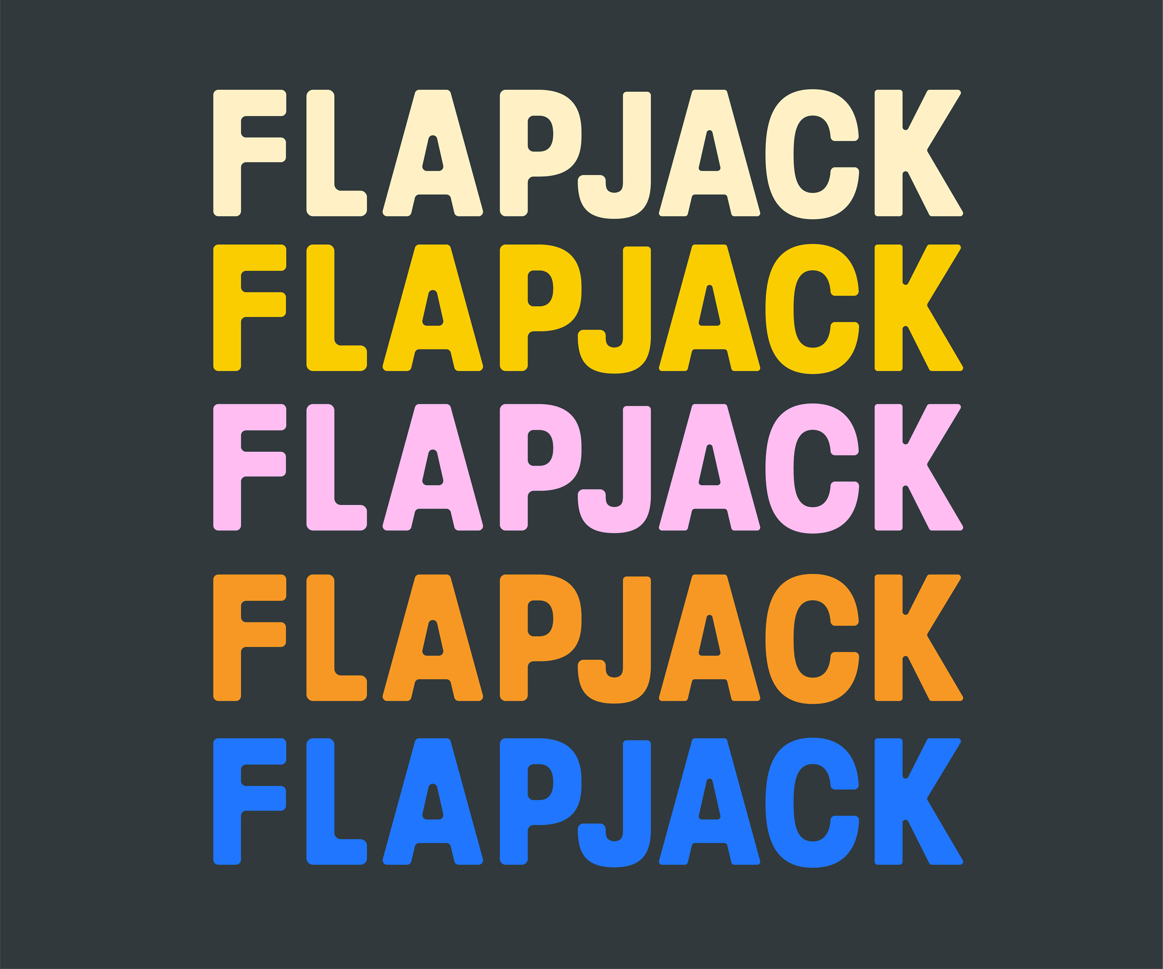
I added onto the brand identity by creating some other secondary icons that can be sprinkled throughout the brand. The eyeball coffee cup and film camera toaster play into this trippy and slightly satirical vibe. The logotype is a customized version of Paralucent Condensed Bold.