
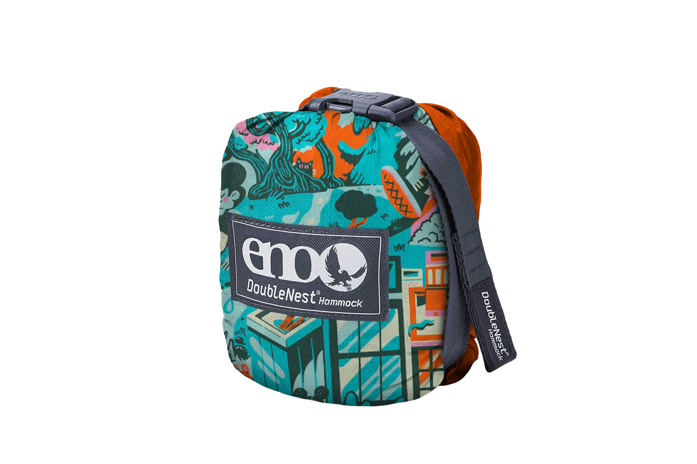
Client: ENO / Eagles Nest Outfitters
Project: Hammock pattern
Year: 2026
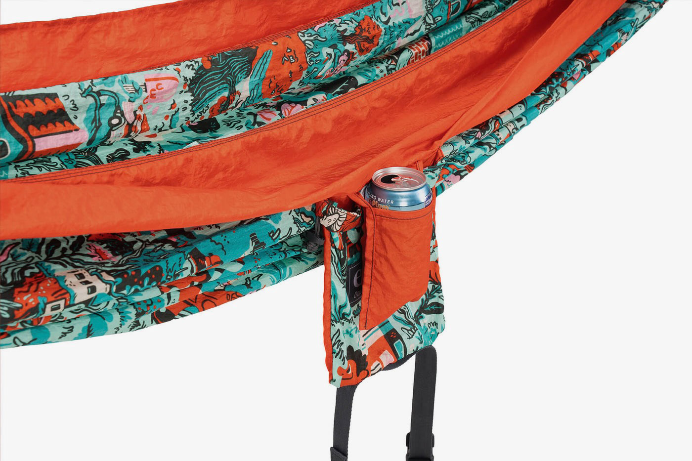
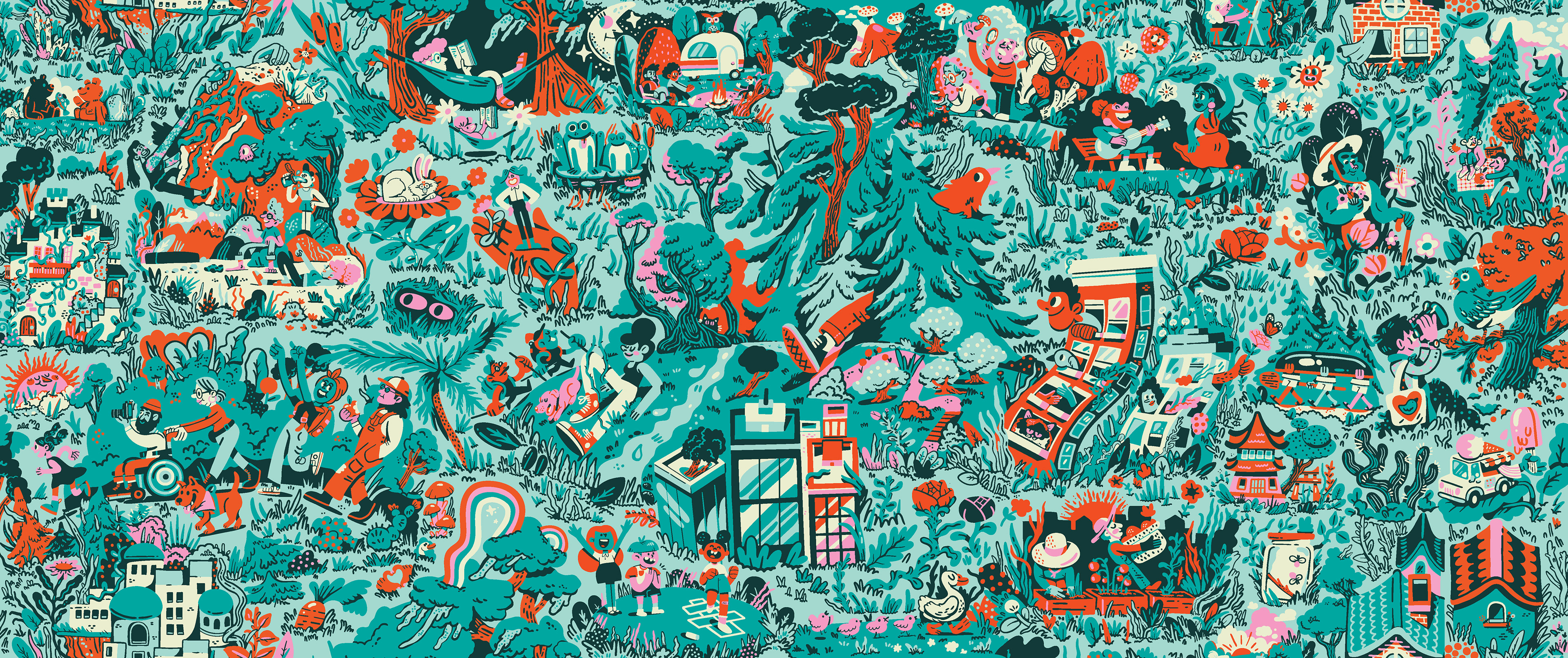
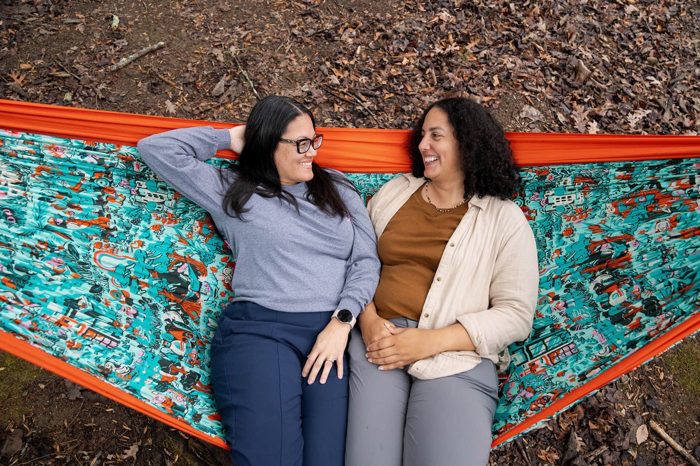
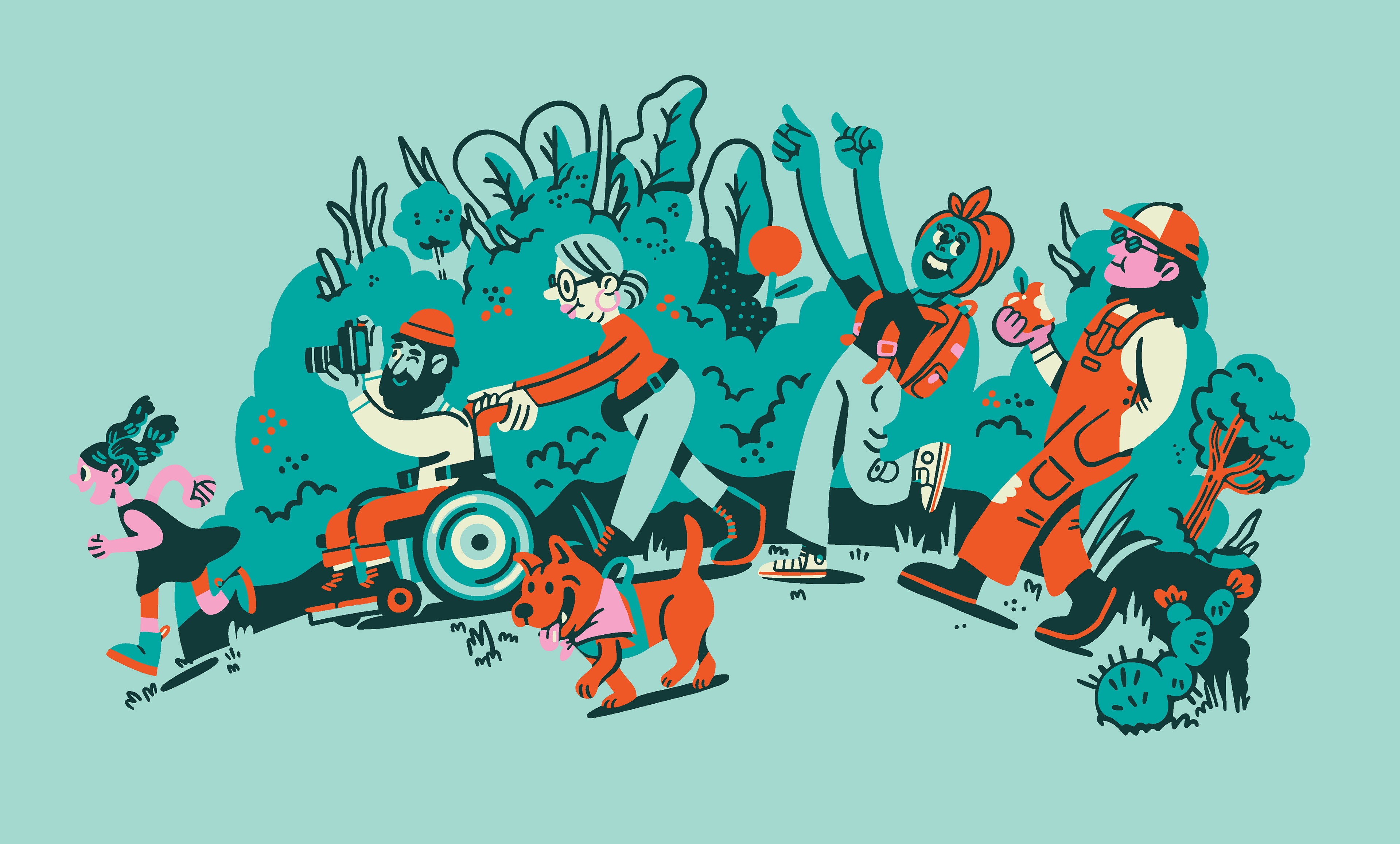
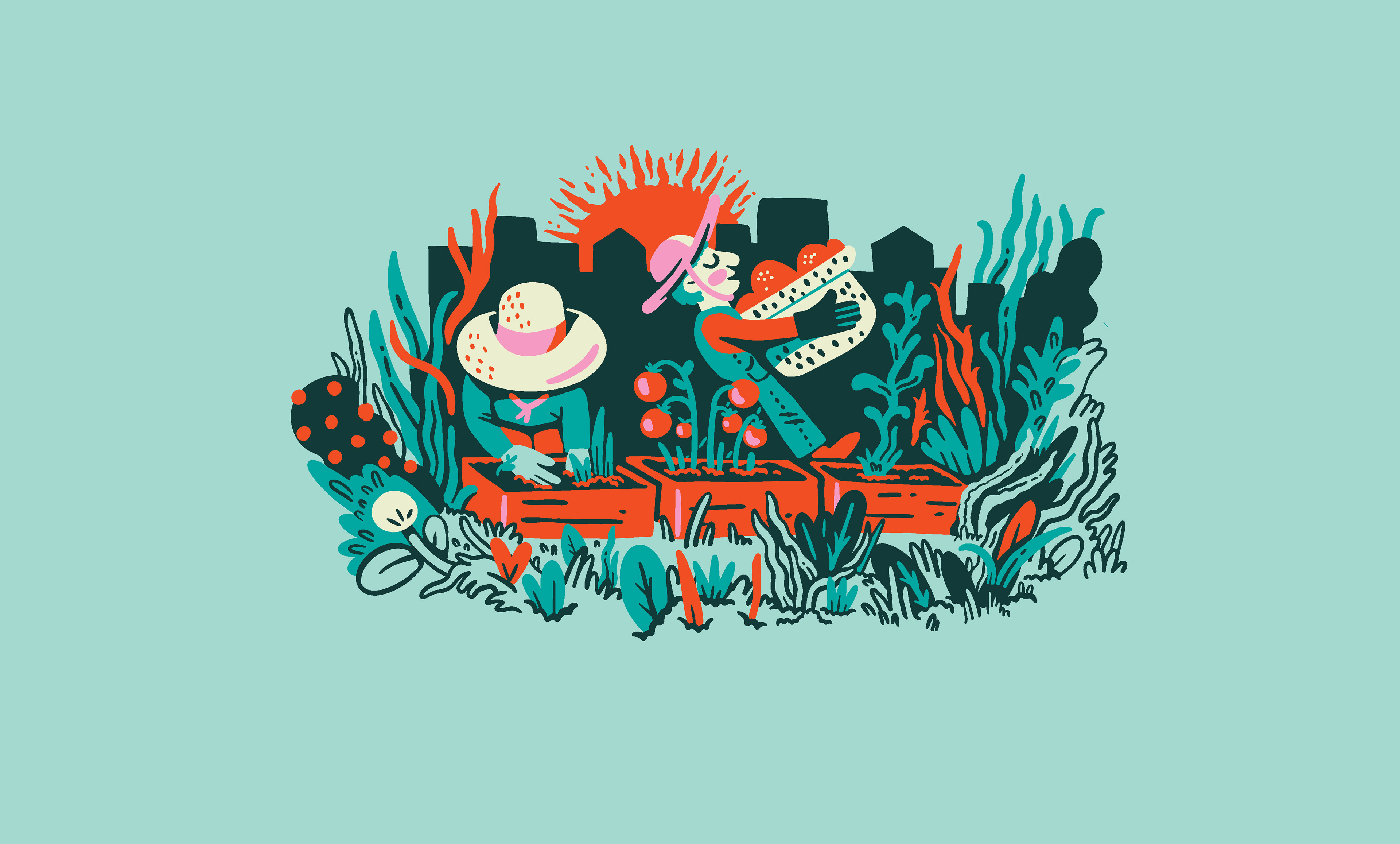
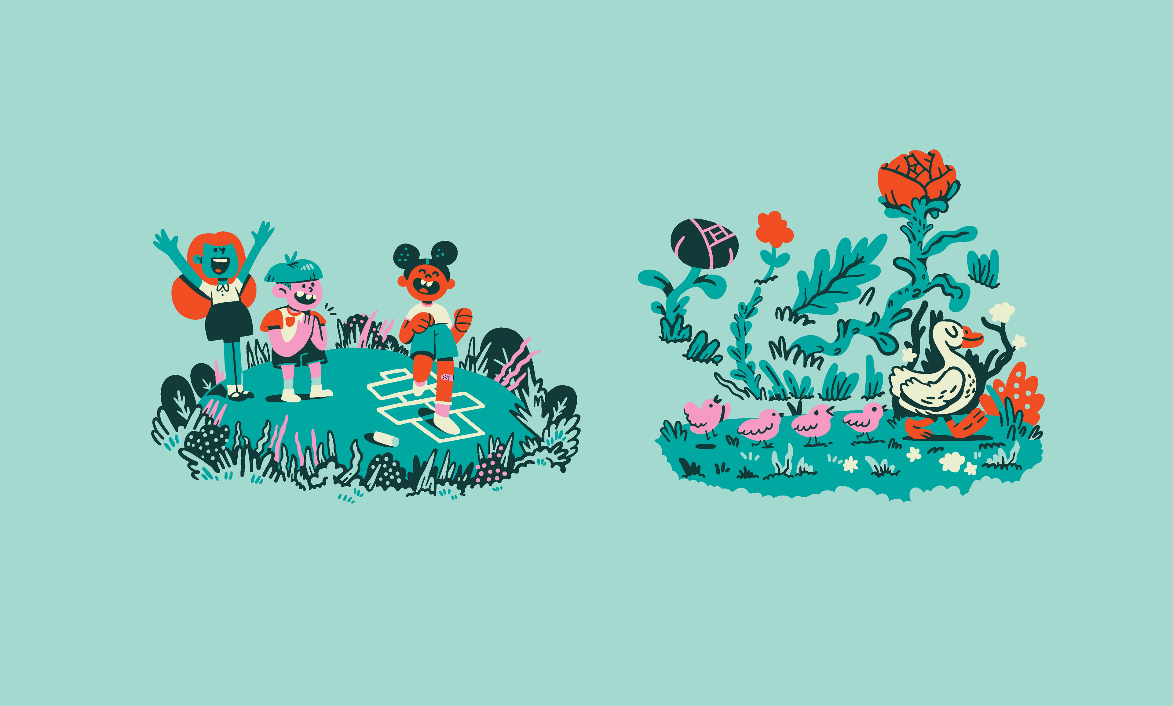
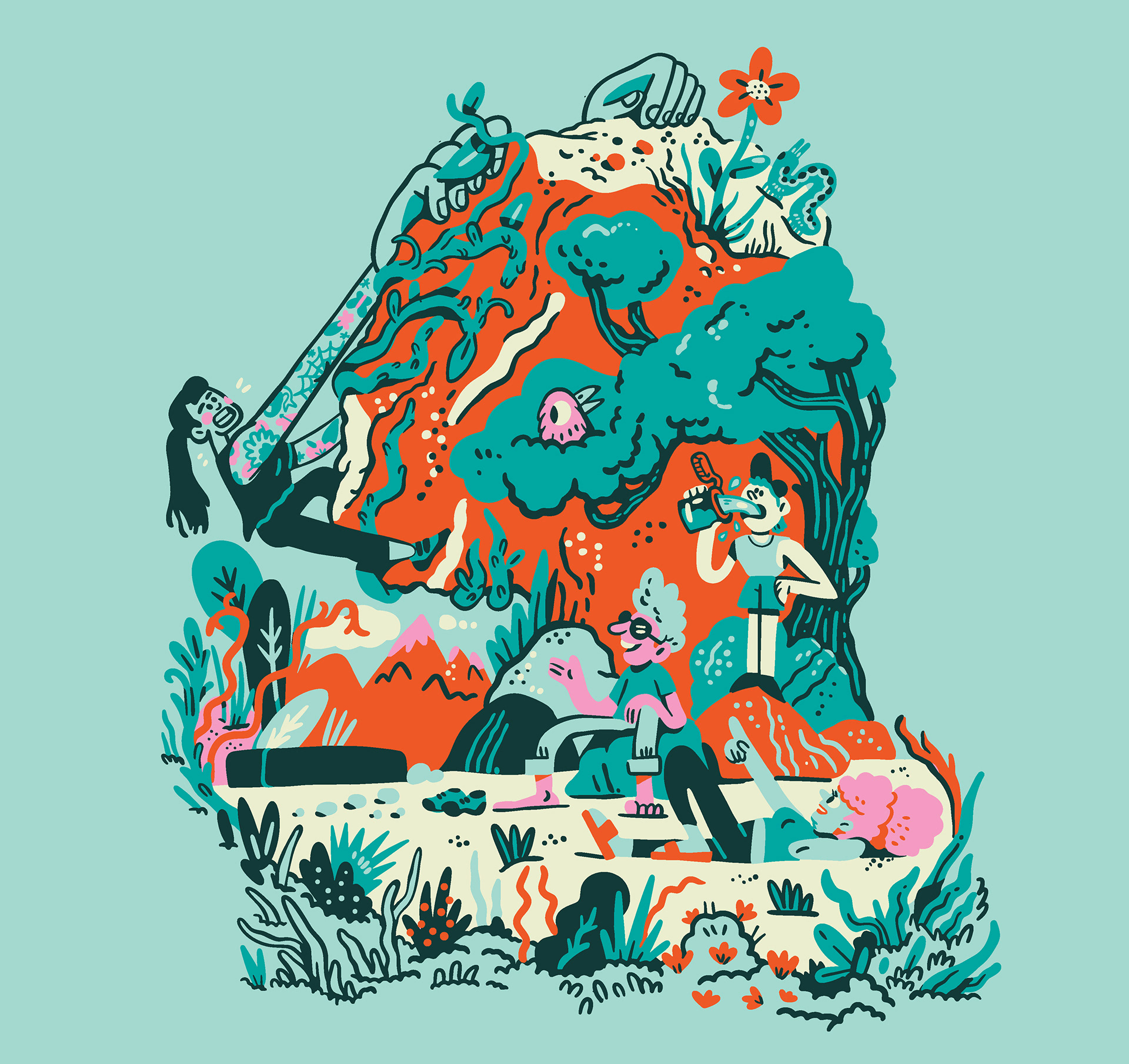
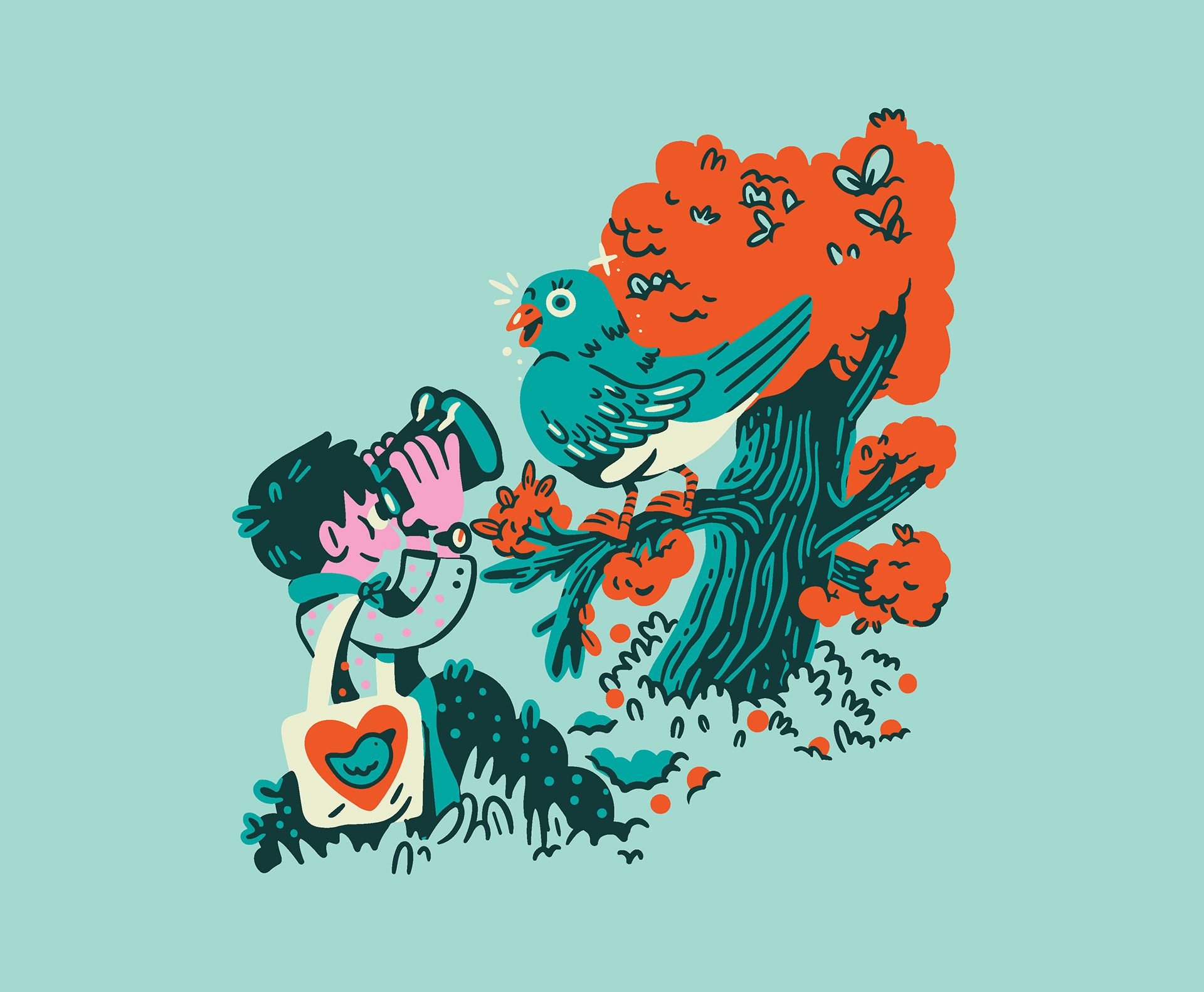
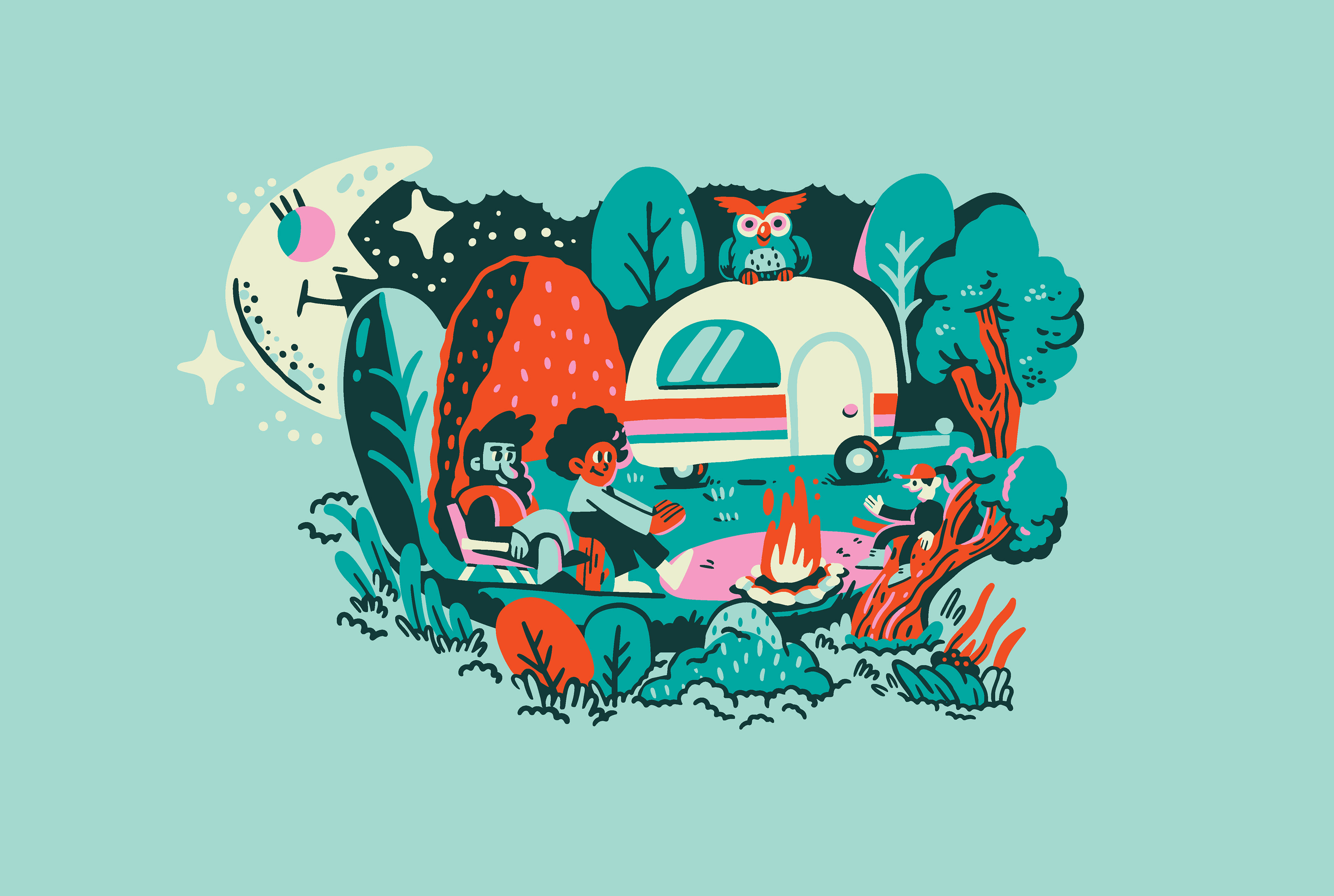
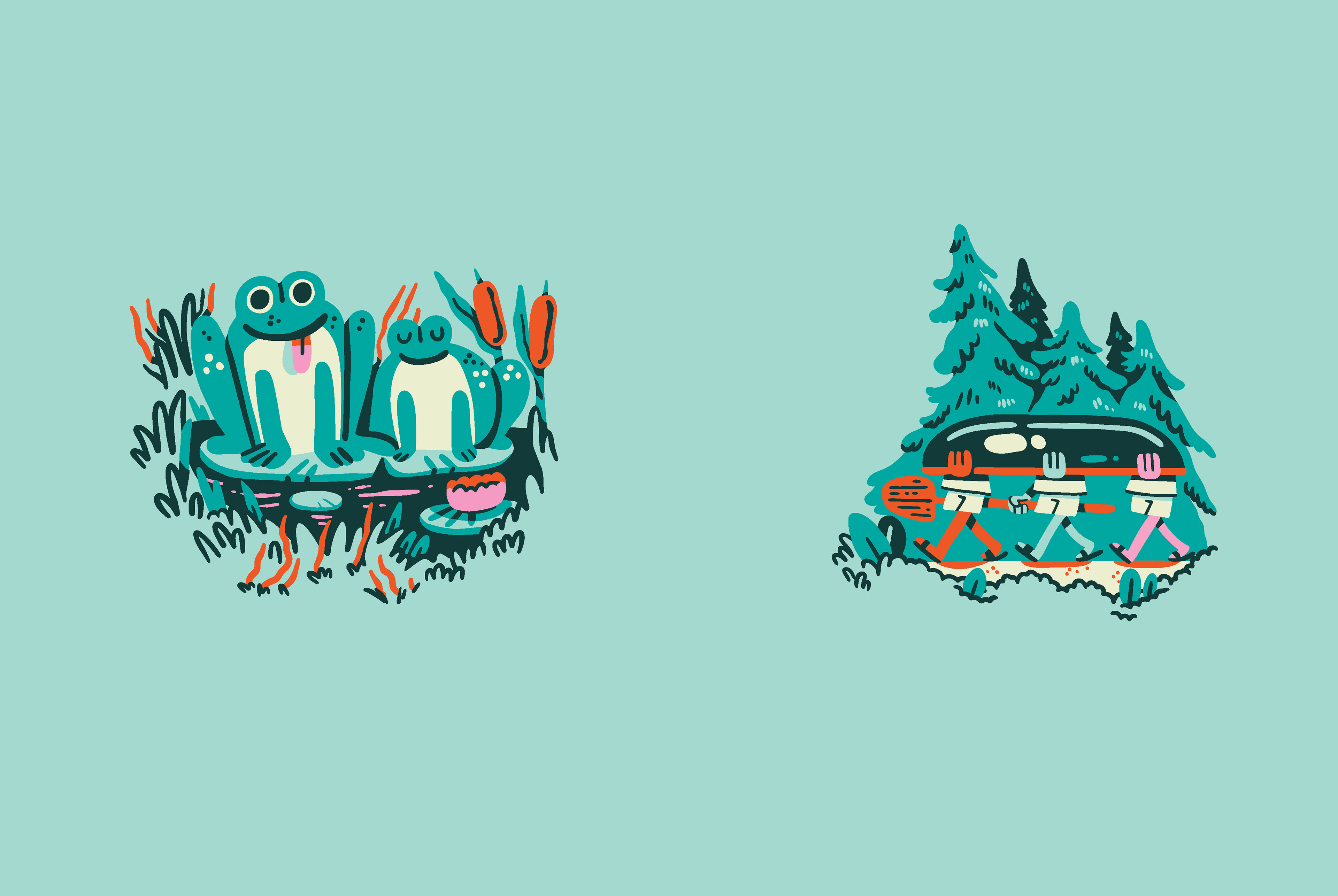
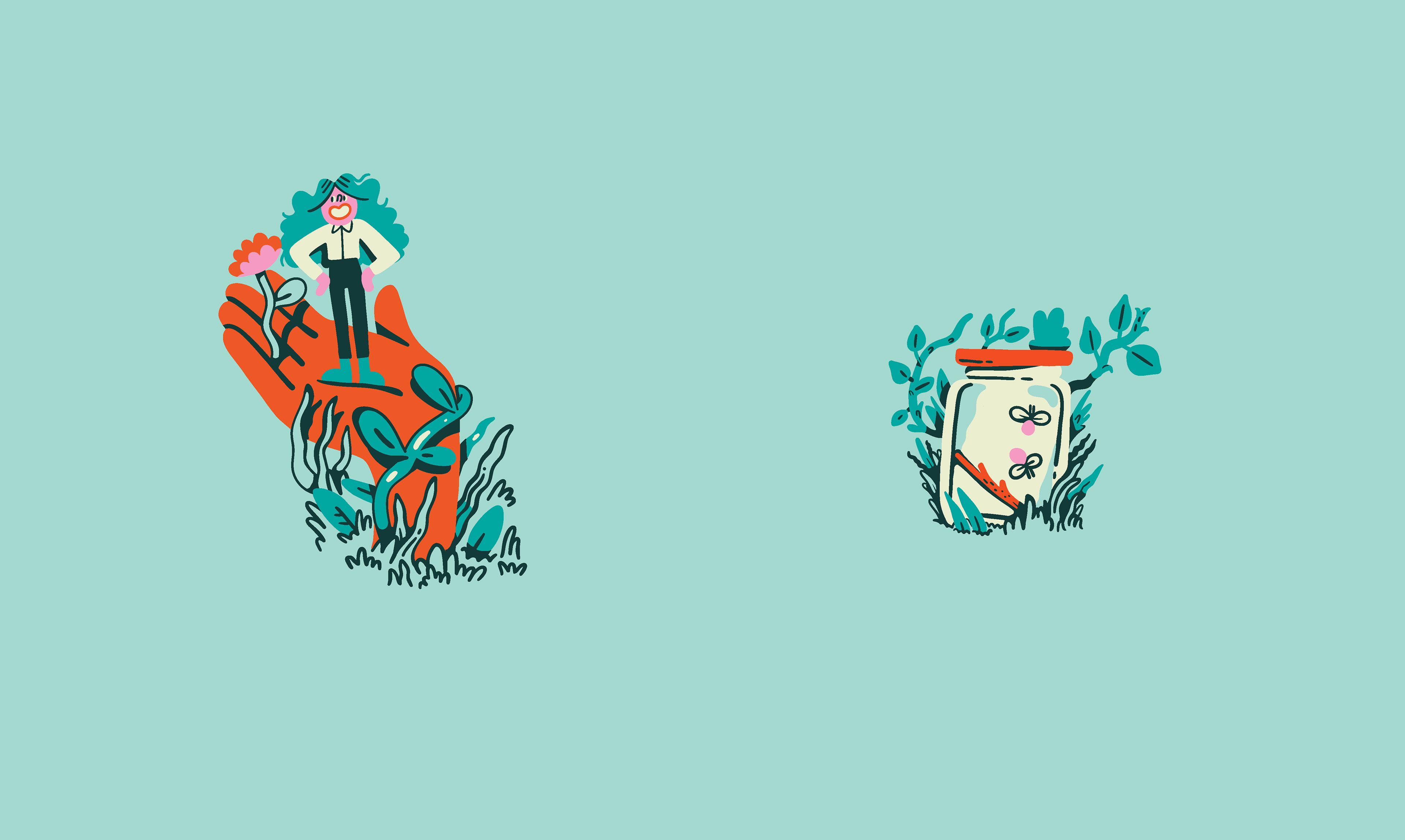
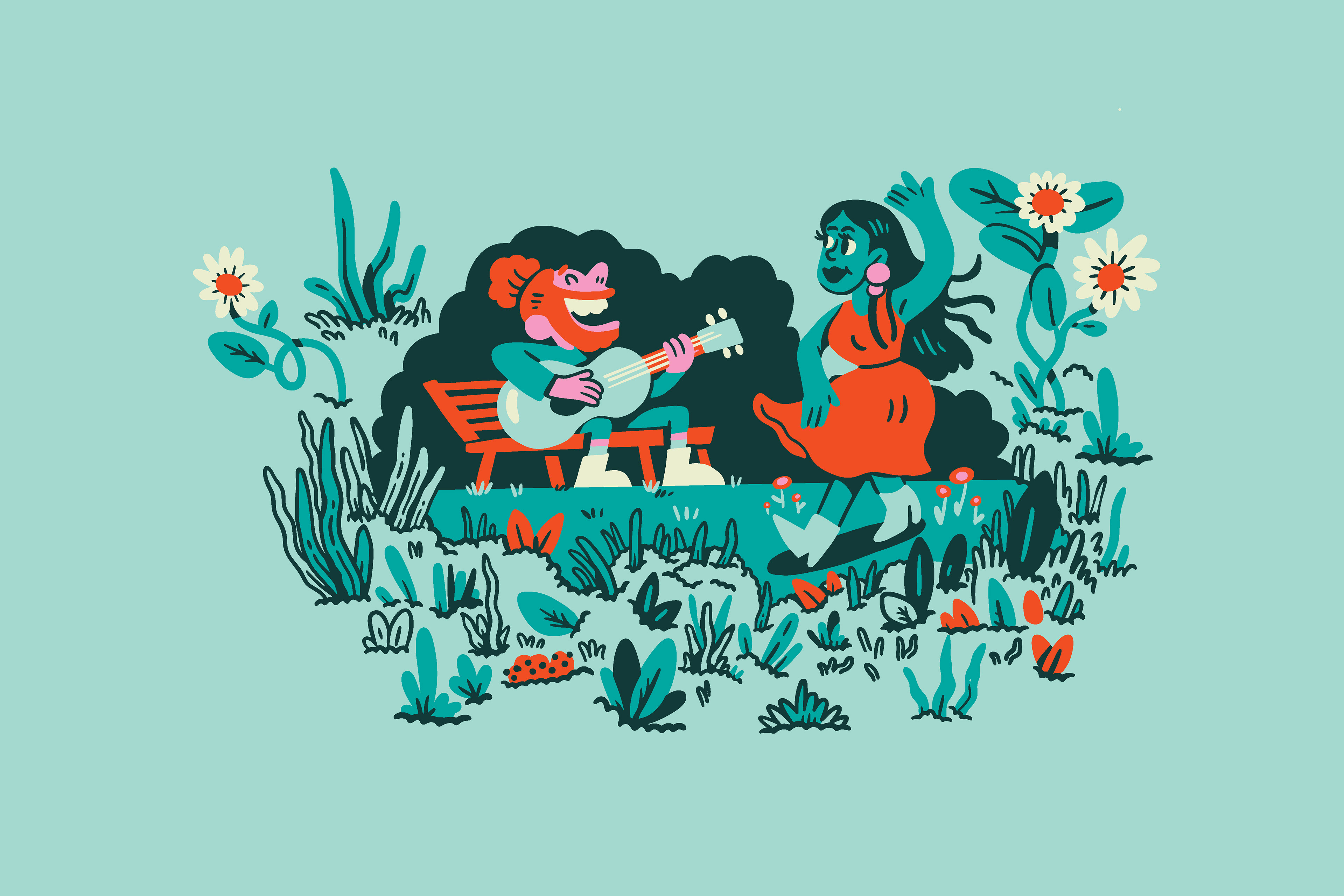
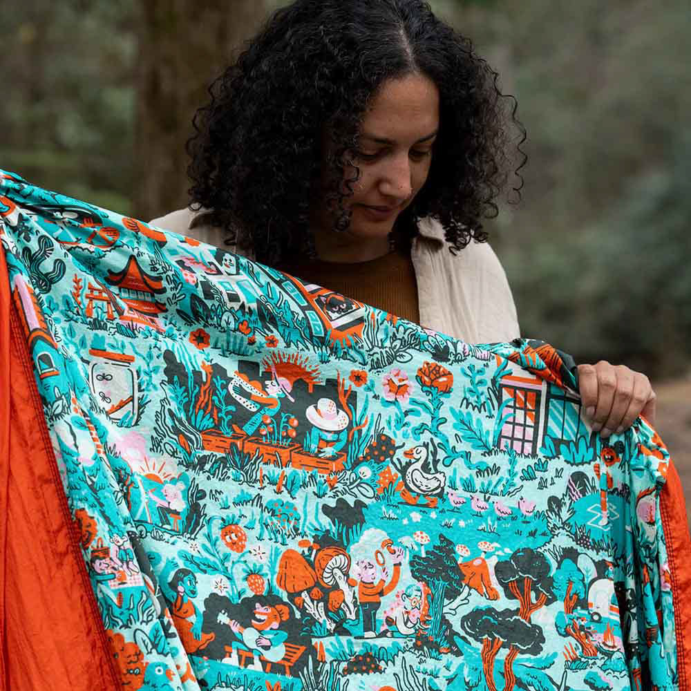
"A Tapestry of Belonging
Celebrating the many ways we enjoy time outside, this hammock was designed to inspire adventure and togetherness. Featuring moments of connection and joy, it showcases shared outdoor experiences that bring us closer to nature and each other." - ENO
Part of the proceeds goes to the Outdoor Foundation, which aims to get people outside for their health, the health of communities, and the outdoors itself, working with partners to increase access, break down barriers, and make nature welcoming for everyone.
Creative Process:
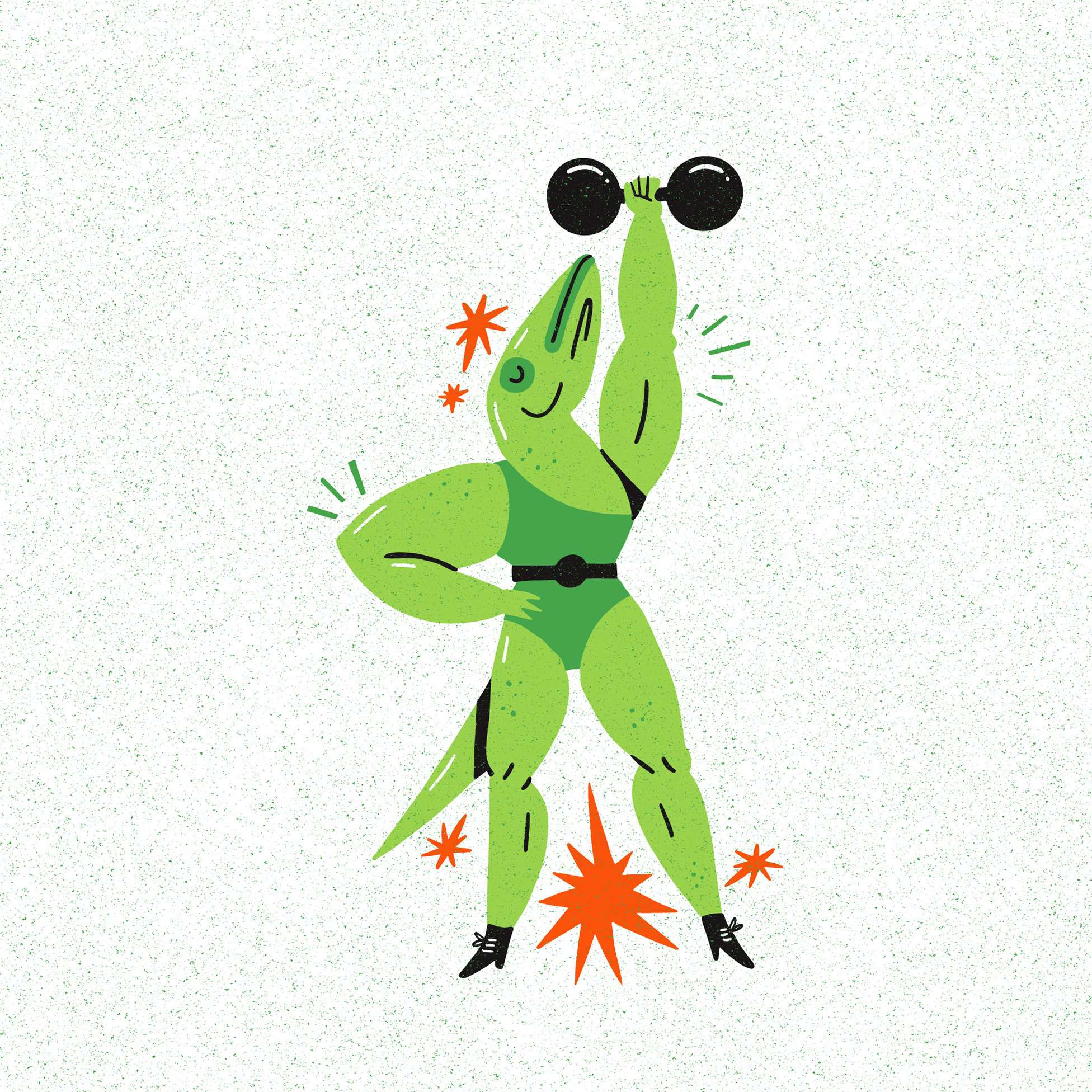
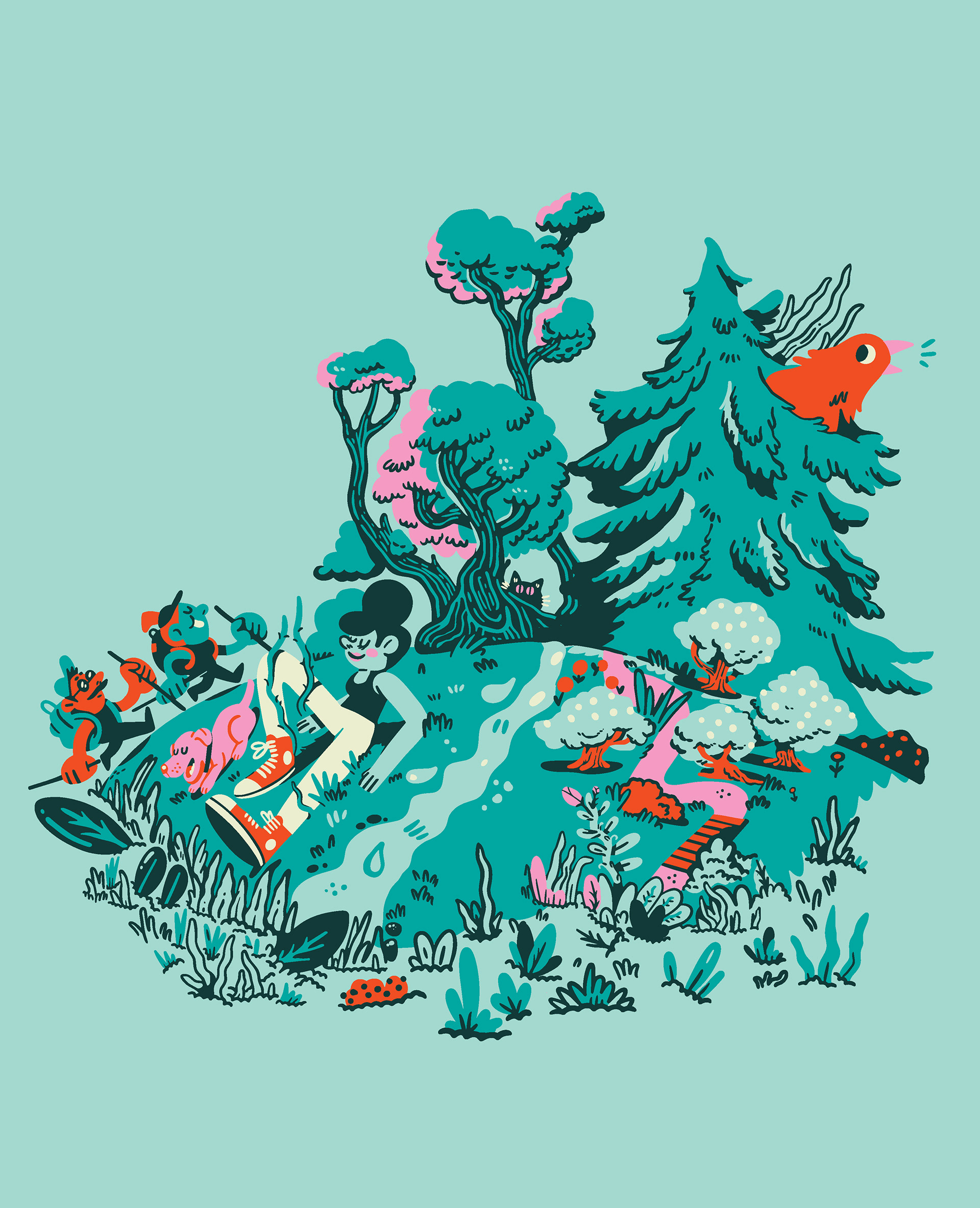
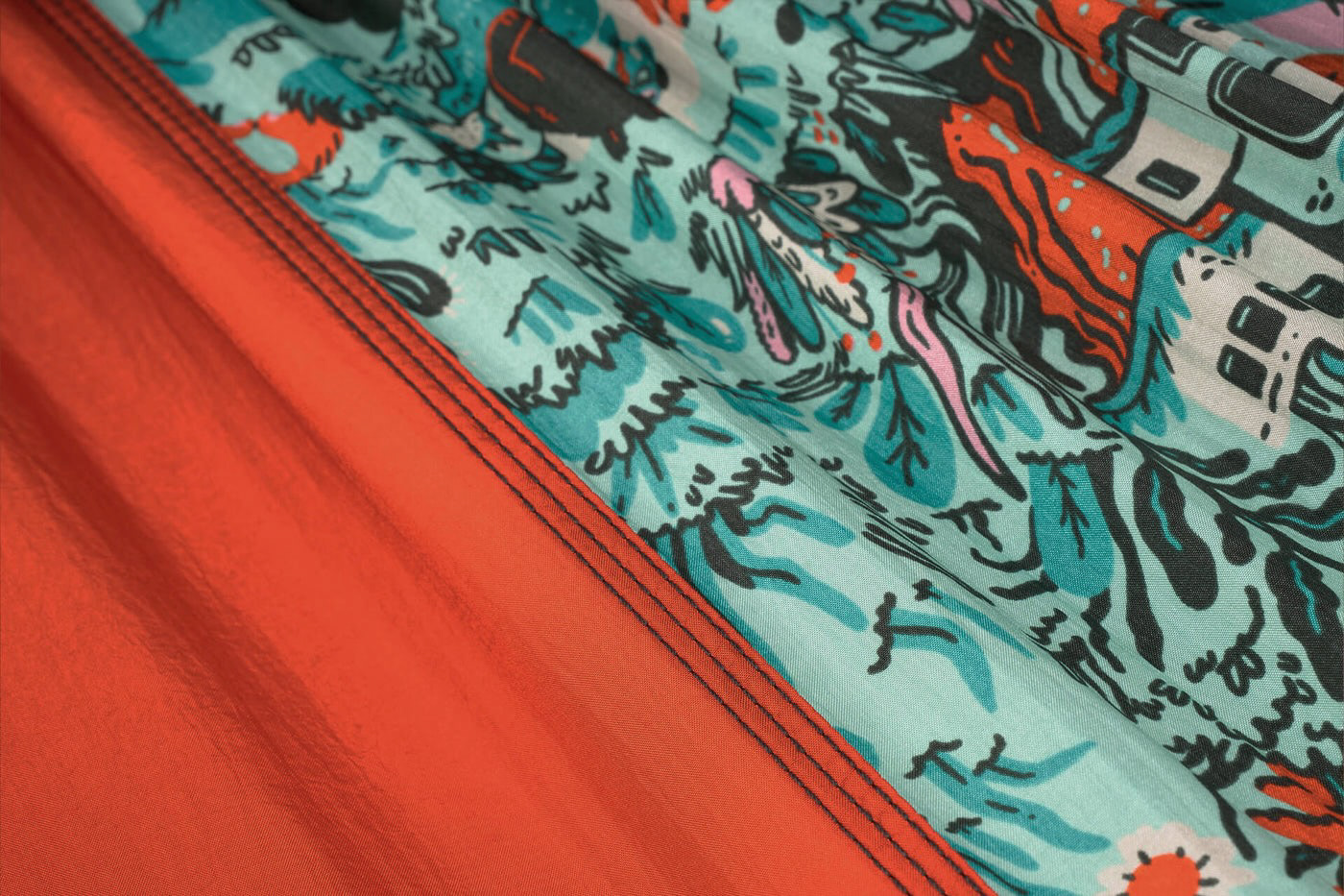
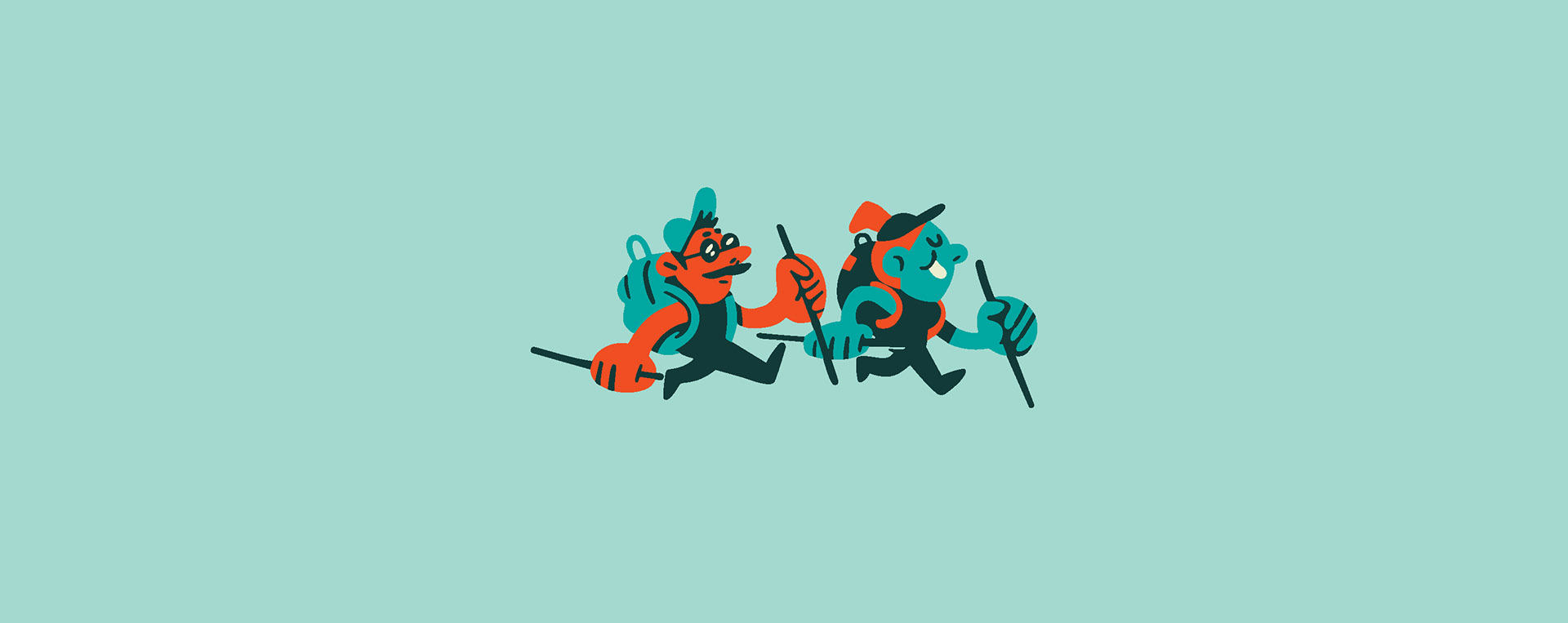
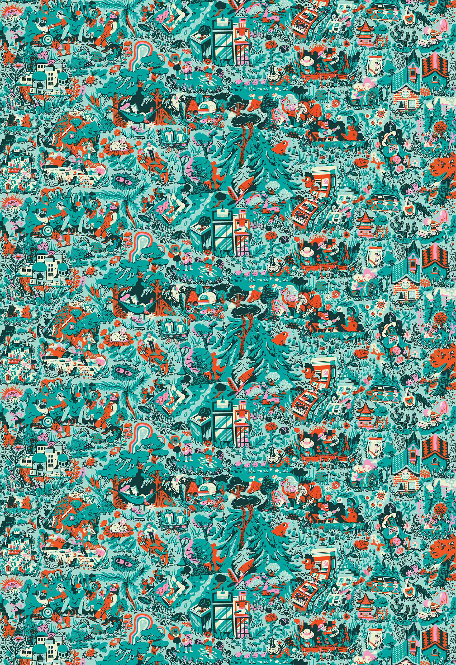
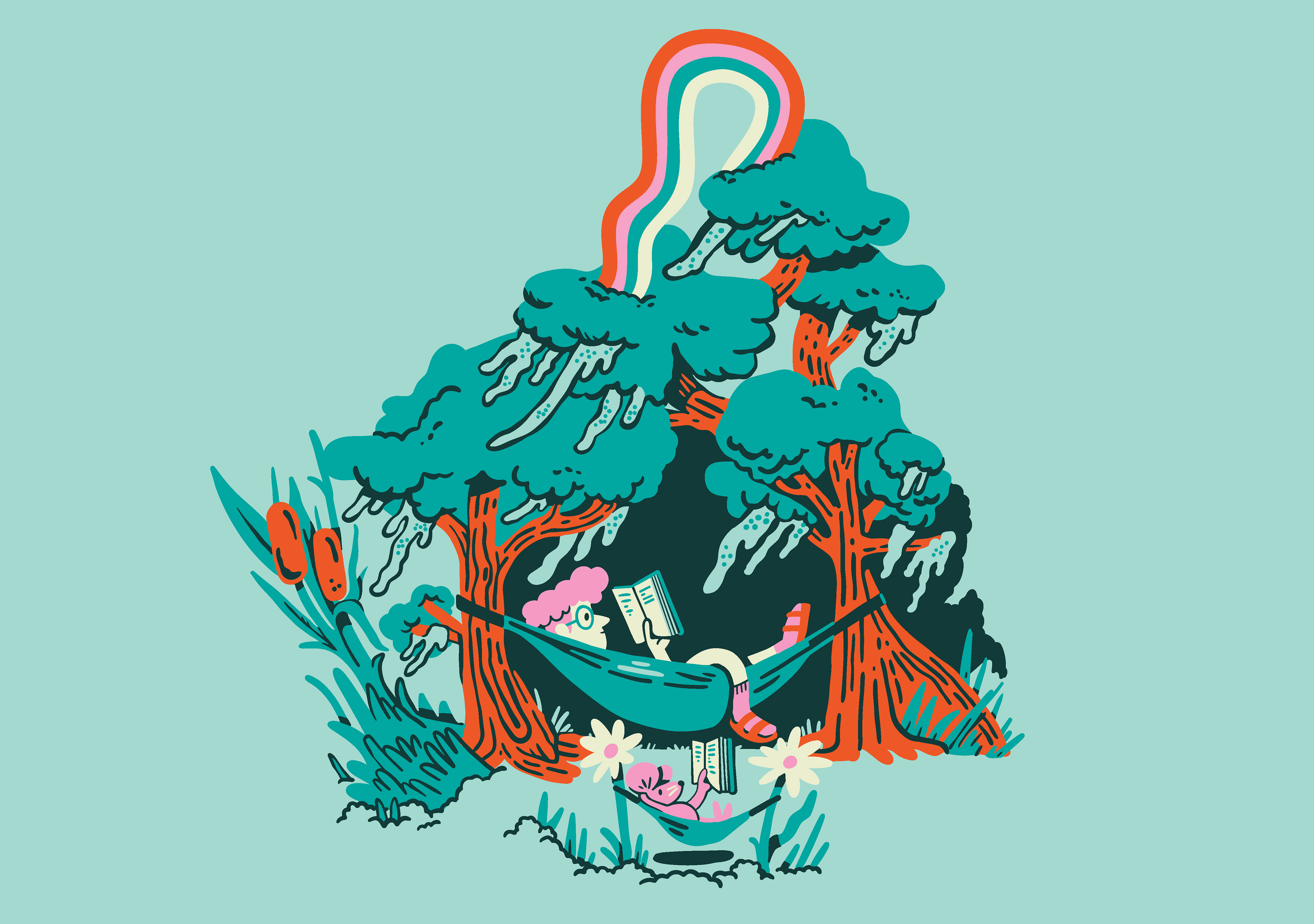
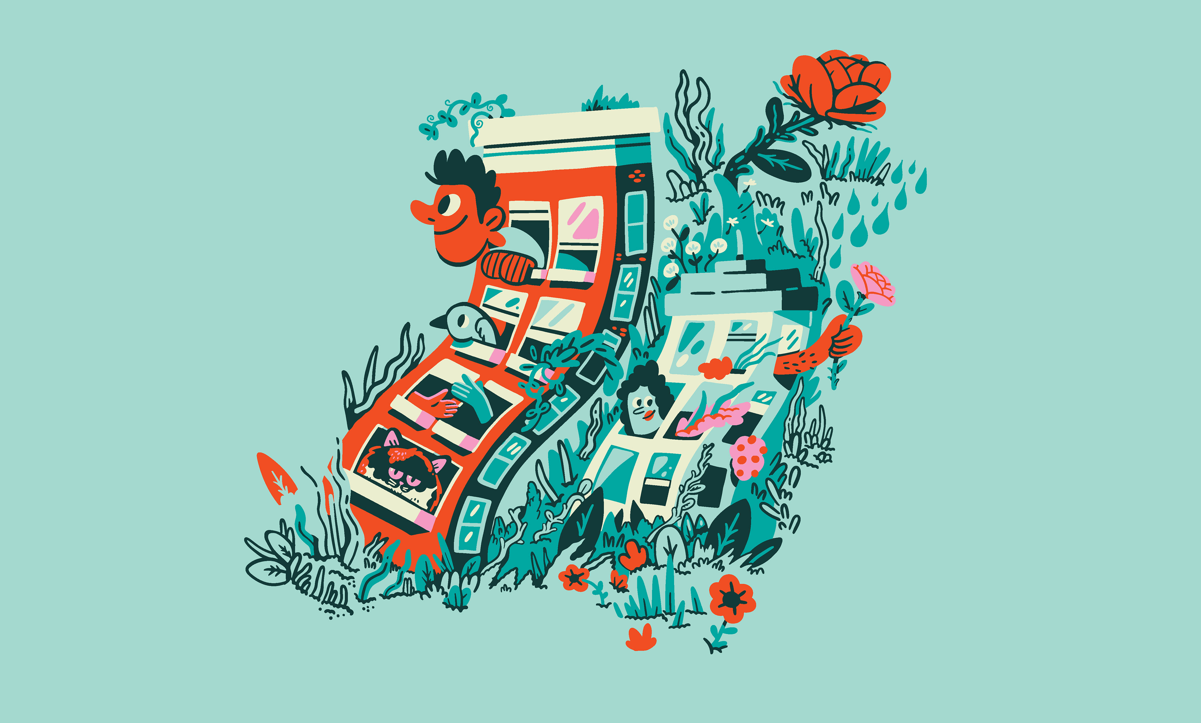
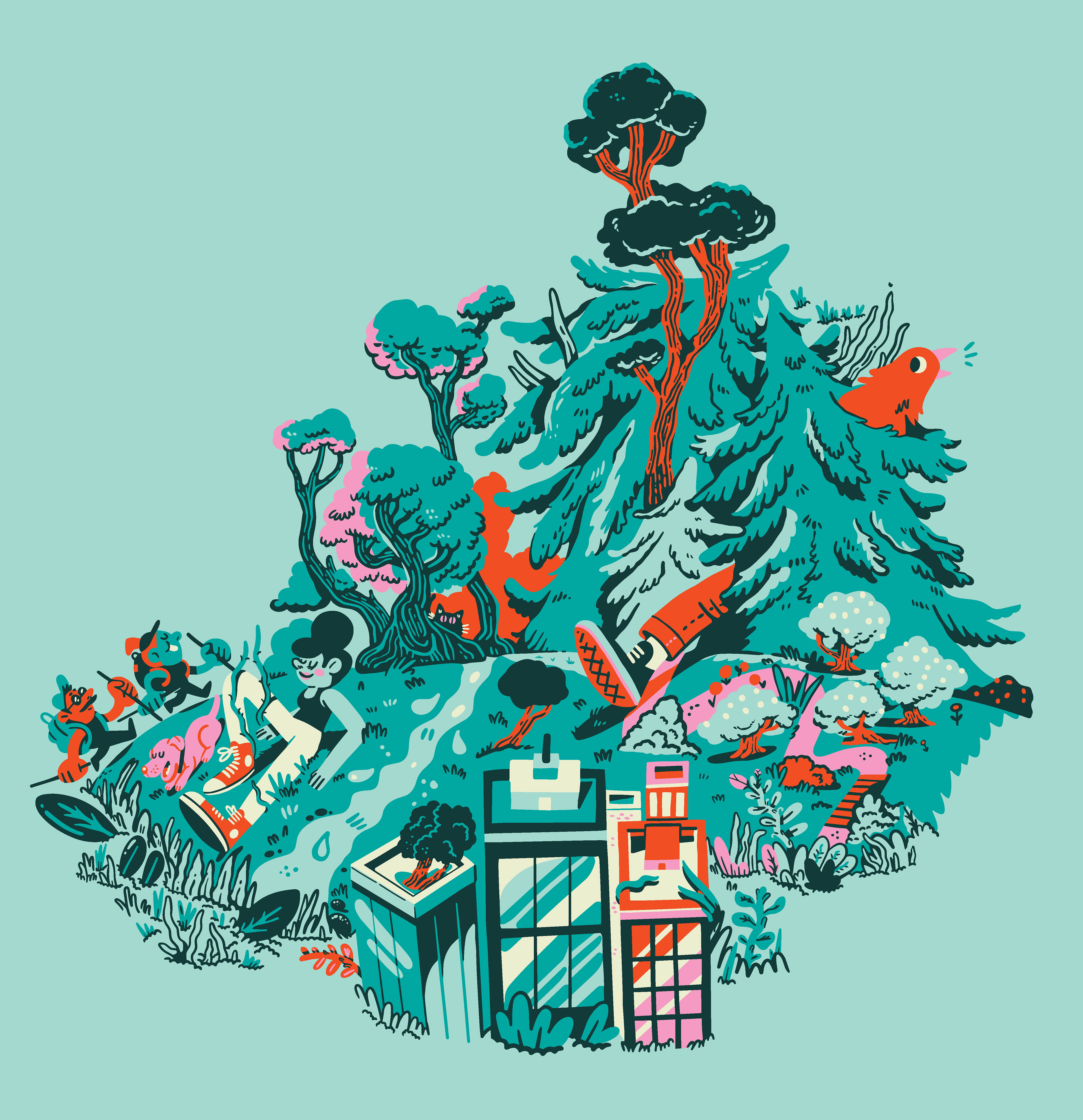
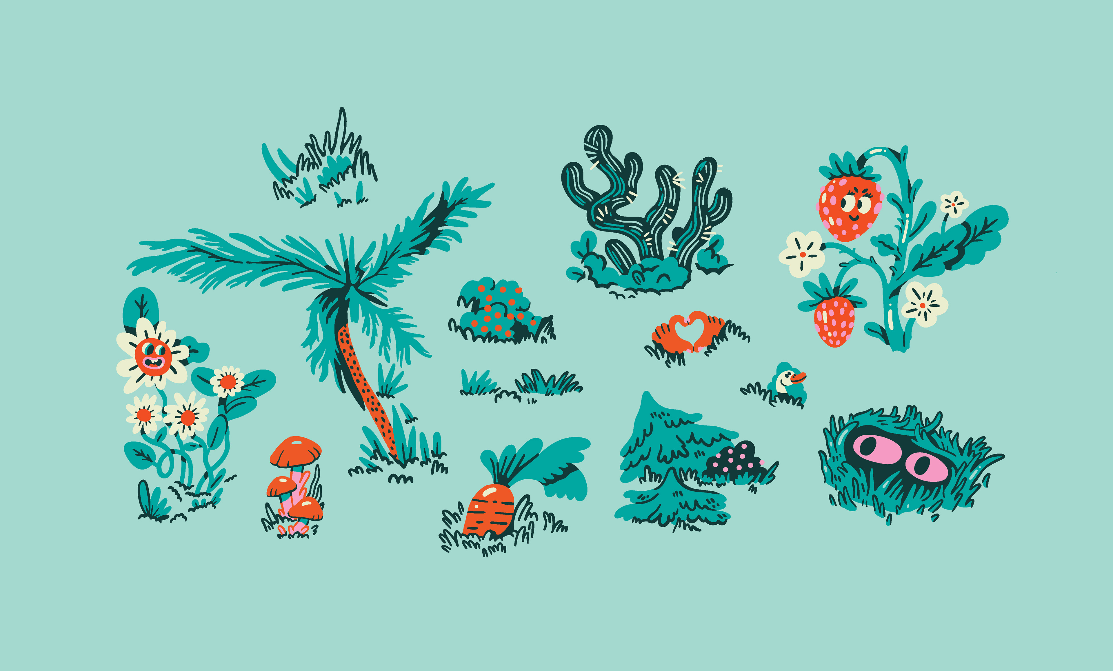
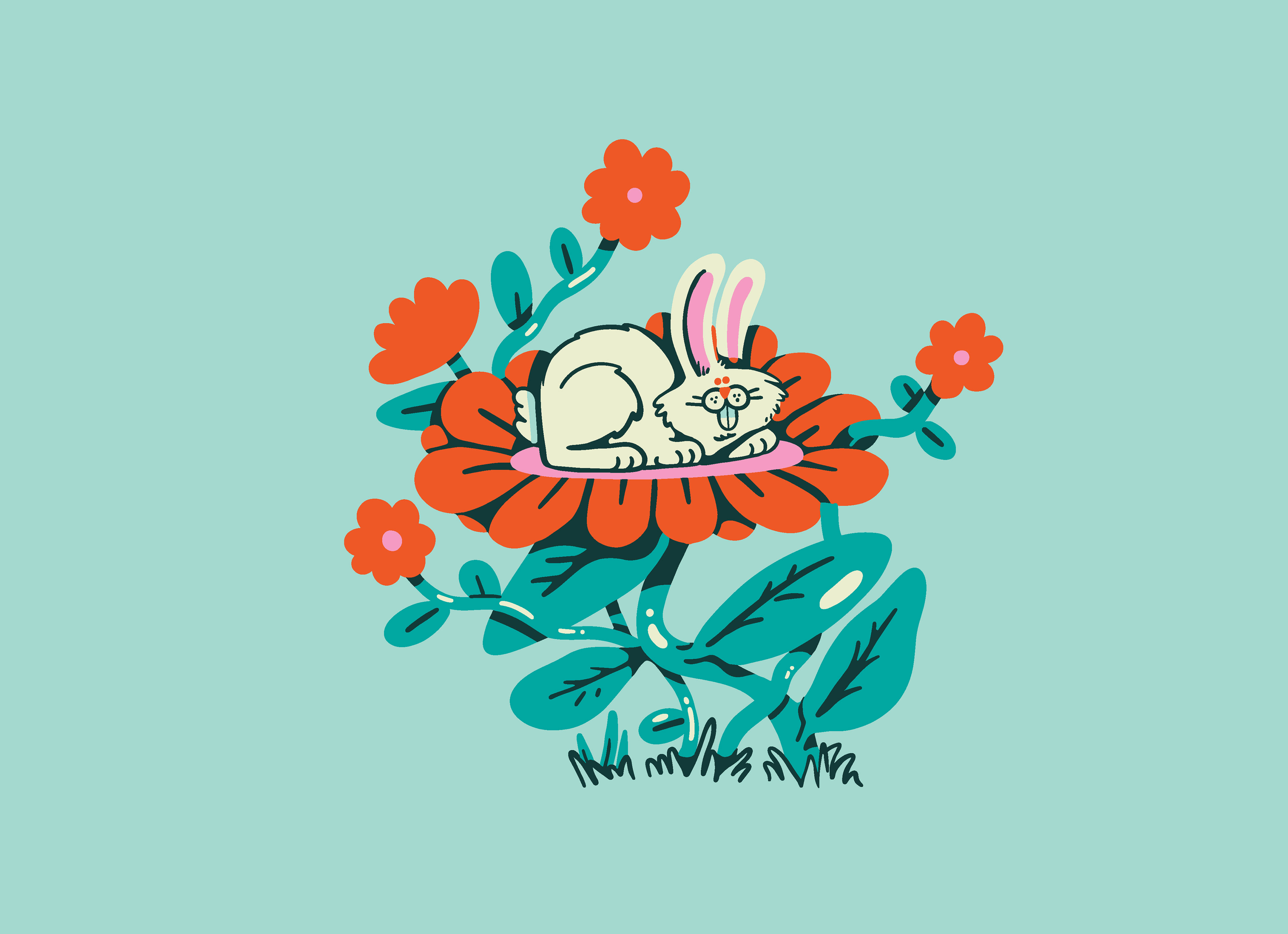
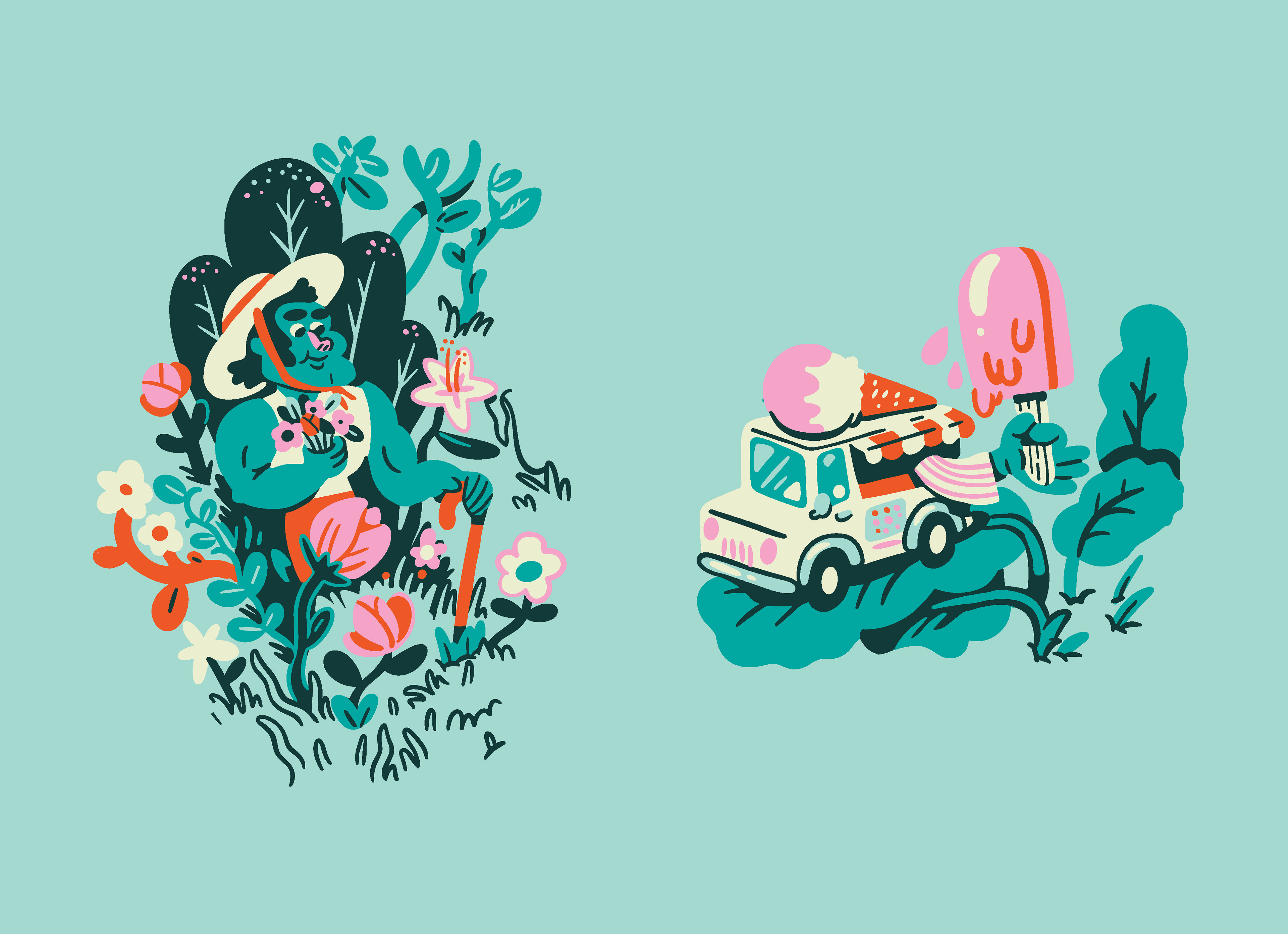
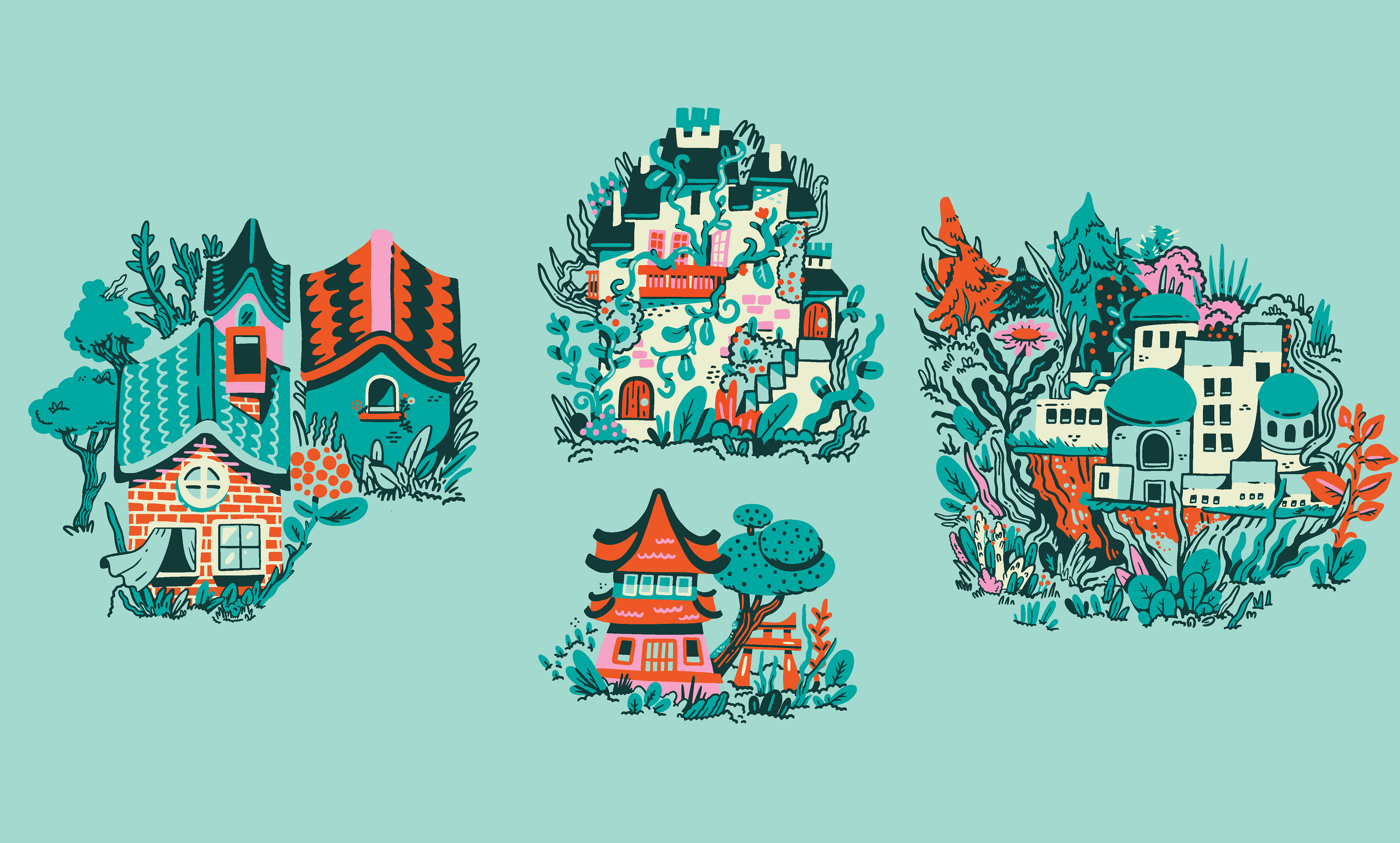
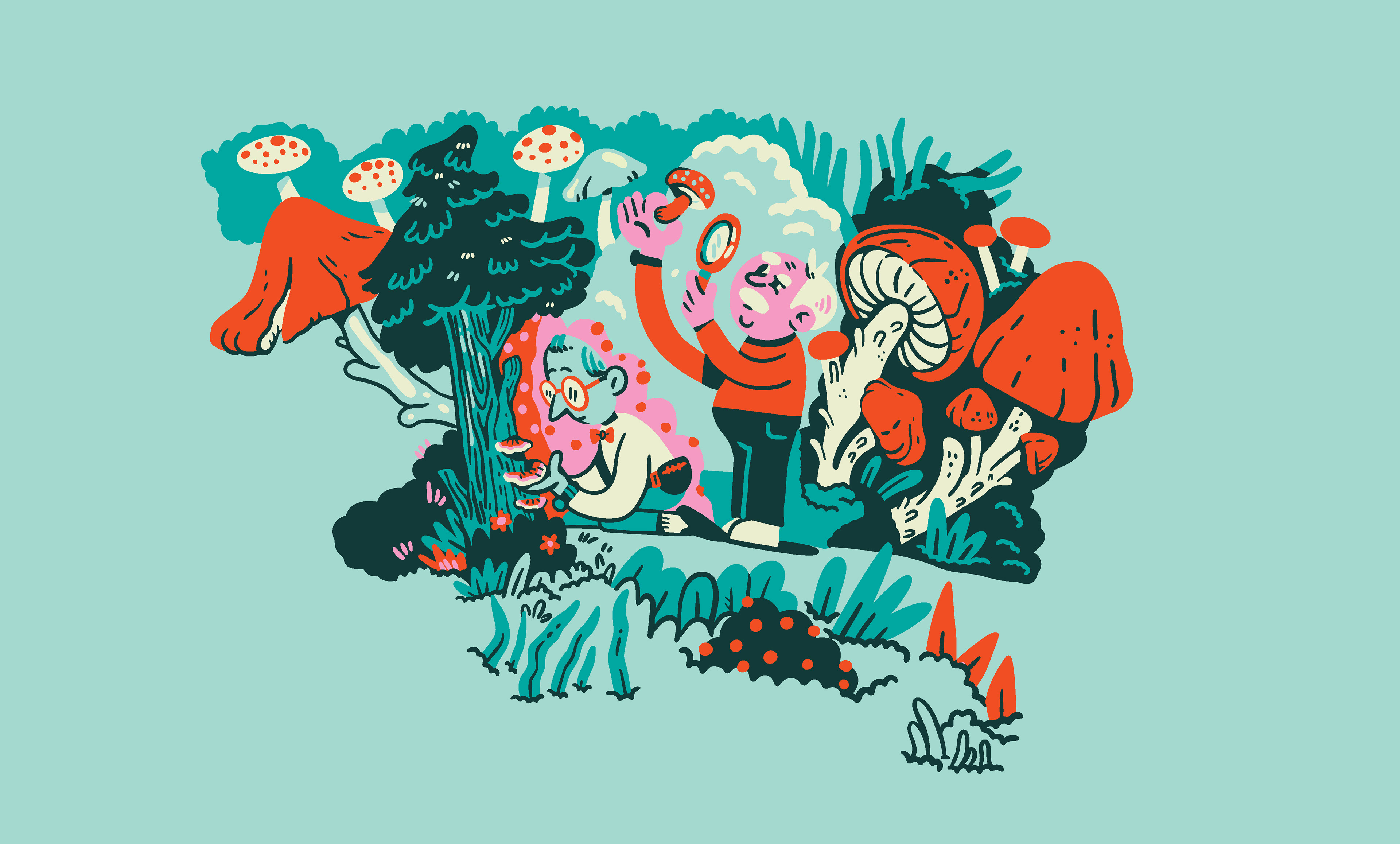
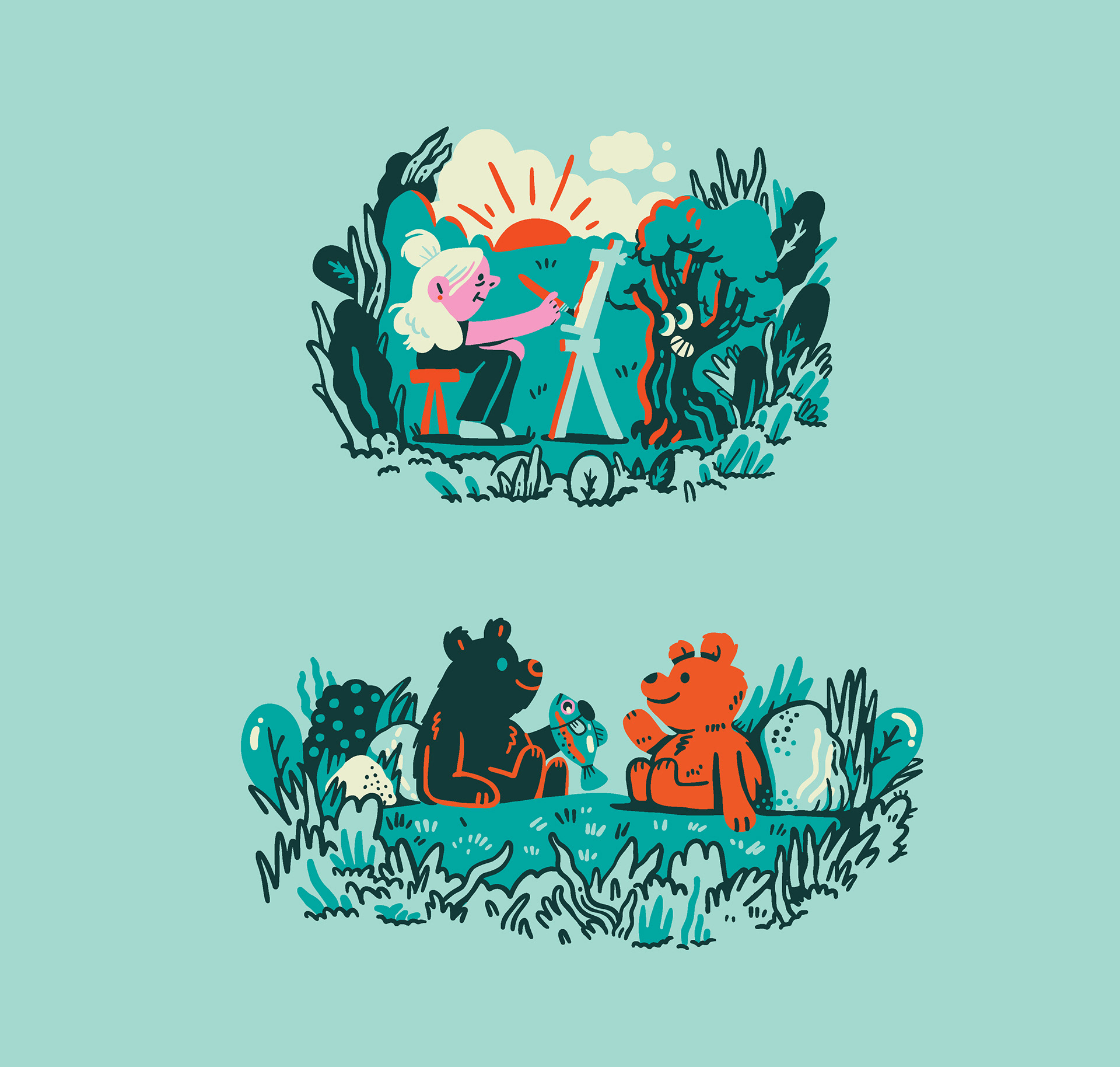
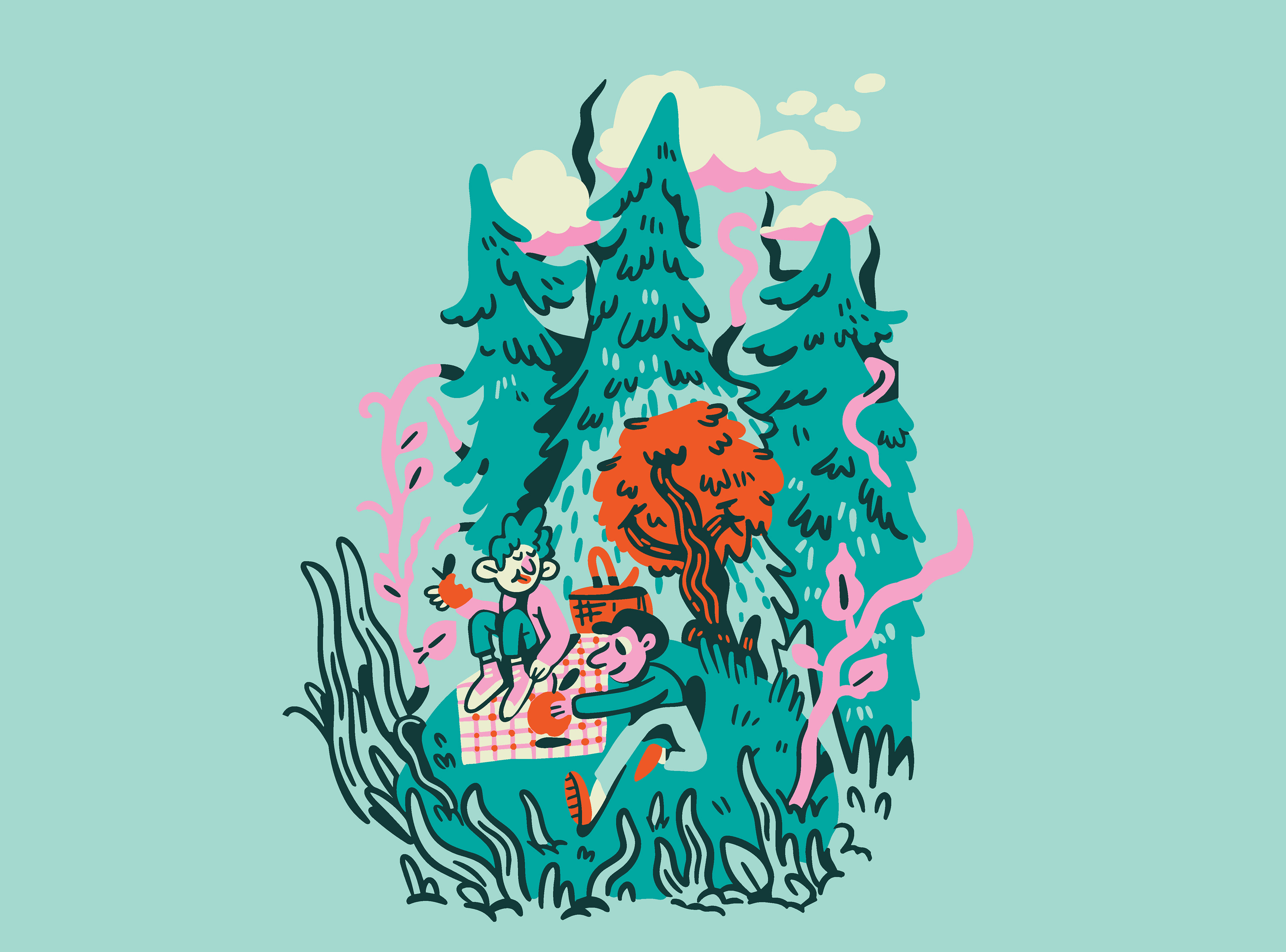
The ENO creative crew knew they wanted depictions of community and it's relationship to the outdoors; all the lovely things people can do in nature, even if it's an urban garden or a park surrounded by buildings. After testing out a few ideas, we landed on some sketches for the style that felt right, and I began to build out scene by scene, piecing them together meticulously. As I worked, I found myself resizing multiple times to fit in more people, more fantastical flora, and more activities. This led to the most detailed illustration I've created thus far! I'm stoked they let me go with such a bold color palette, encouraged me to lean into the goofy characters, and ultimately cheered on maximalist ambitions. ENO hammocks are iconic, and I've been a long-time fan of the brand, so getting to collaborate with them was a dream; it was even better that it benefits a meaningful organization.
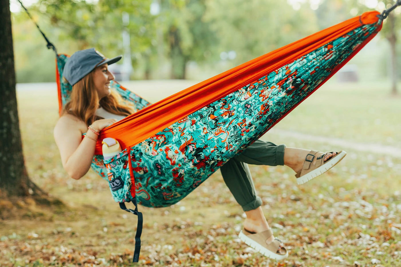
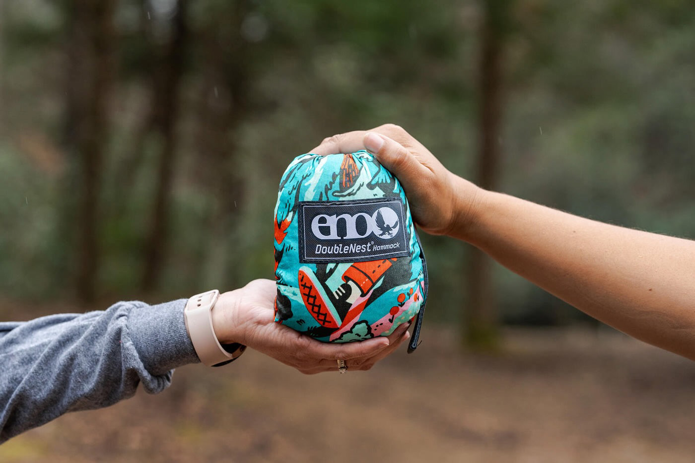
Grab one here
Credits:
Evan Weinstein
Art Director
Art Director
Kathryn Wozniak
Senior Industrial Designer
and Product Developer
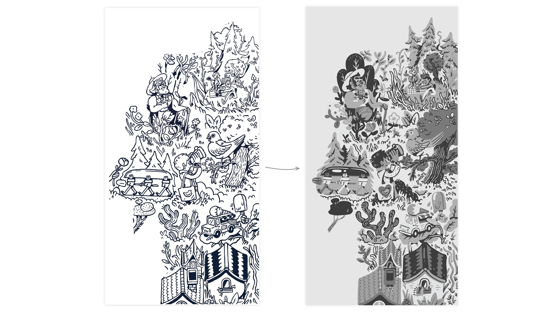
VERTICAL REPEAT
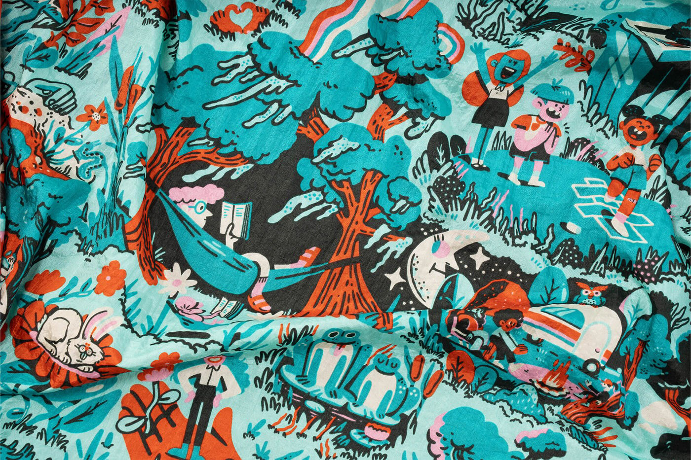
The print is made of 4 panels so to get the most out of the space, we made the illustration go full bleed horizontally and seamlessly repeat when stacked vertically.
Process
I started by presenting 3 concept ideas: The one that was chosen, one that was more lettering-focused, and another that had a more grid-like structure. If you're interested in that first round and want to see the deck, email me and I can share it with you!
Sketch:
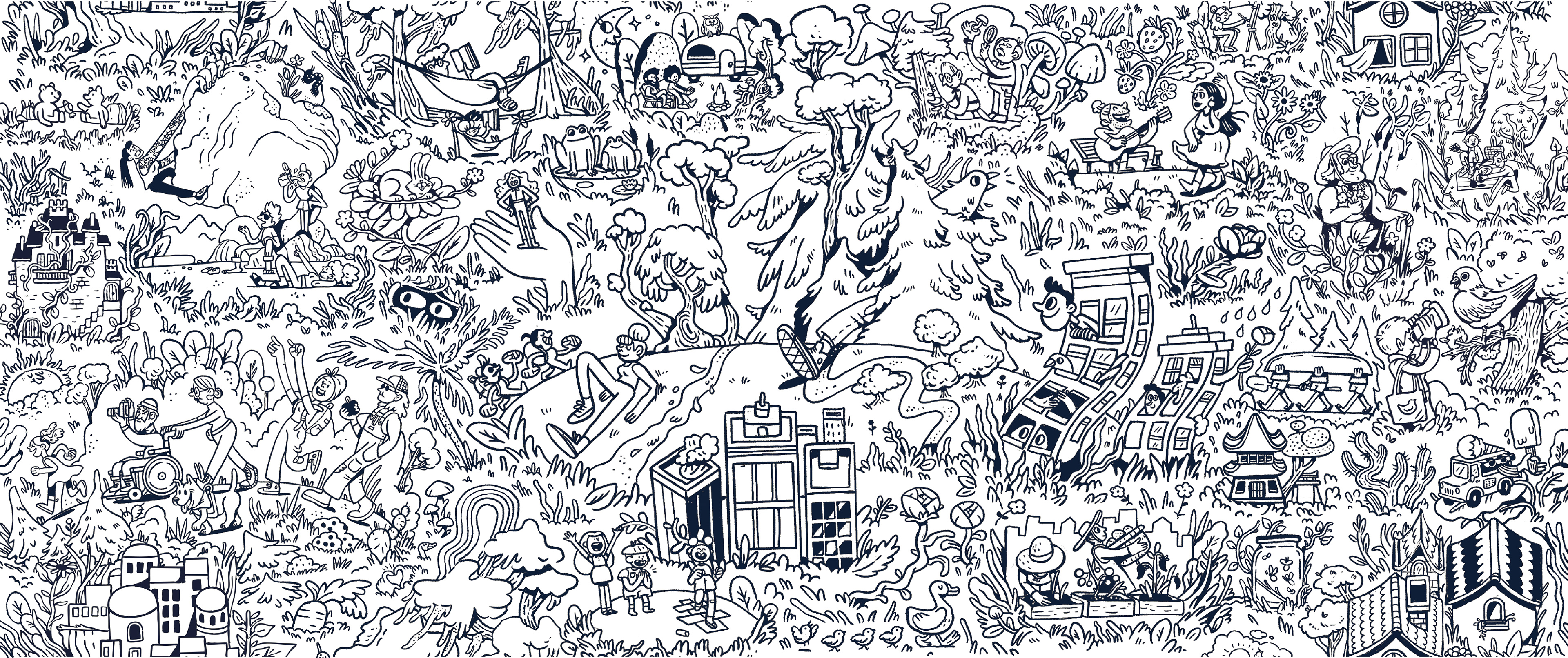
After completing the full sketch, it was hard not to see just a big coloring book. Which is fun, but unfortunately not the vibe I was going for. So I proposed using a style with fewer outlines and tested the idea on a section of the sketch.
I think using more solid blocks of color and saving the outlines for details and shadows creates a playful, professional feel. With such a dense illustration, the outlines almost became too busy and harsh to look at so I'm excited they were down to experiment with another approach at this stage in the process. I still very much love outline-heavy work, but I'm never against doing something a little differently when something feels right for a project, and this one certainly called of this unconventional approach.
Style adjustment: